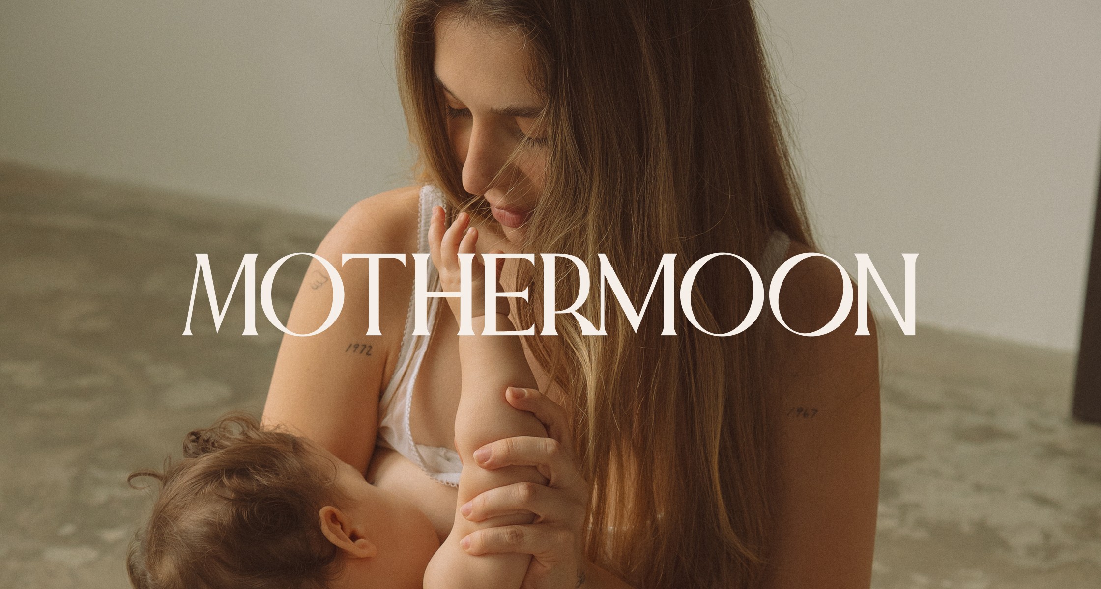
Mothermoon Studio
read full case study
Branding a category-defining wellness spa designed for mothers
A strategy-led brand, digital experience, and launch platform for a spa built around the realities of motherhood.
THE CHALLENGE
Verena, the founder of Mothermoon, reached out while preparing to launch a wellness spa created specifically for mothers. She had a vision to build a space that finally puts mothers at the centre of wellness, without guilt, judgement, or logistical barriers.
The challenge was to define an entirely new category. Existing spas in the market focused on beauty, relaxation, or luxury, but none spoke clearly and directly to pregnancy, postpartum, or the emotional realities of motherhood. Mothermoon needed a brand that felt premium and special, while remaining deeply empathetic and restorative. The experience had to work both emotionally and operationally—from messaging and booking to in-space experience.
OUR APPROACH
This was a full-scope collaboration covering brand strategy, creative direction, identity, copywriting, and website design and development.
We started with an in-depth strategy phase to define Mothermoon’s positioning, audience, and long-term vision. The goal was to create clarity and confidence at every touchpoint, allowing Verena to launch with a strong foundation rather than guessing her way forward.
Brand Strategy & Positioning
At the core of the strategy was one clear idea:
A wellness spa for (overwhelmed) mothers that removes the guilt and barriers of self-care.
We defined Mothermoon as a category-defining space that:
– Prioritises pregnancy- and postpartum-safe treatments
– Welcomes babies, removing the biggest barrier to self-care
– Combines expertise with empathy
– Treats rest as a necessity, not an indulgence
The brand was positioned around three promises:
– Belonging – a space designed emotionally and practically for mothers
– Restoration – treatments that genuinely support physical and mental recovery
– Authenticity – honest, relatable communication grounded in real motherhood
Extensive audience work mapped three key groups: first-time mothers, experienced mothers, and gifters. Each group required different reassurance, messaging, and decision triggers, all of which informed the brand voice, website structure, and booking experience.
Visual Identity & Creative Direction
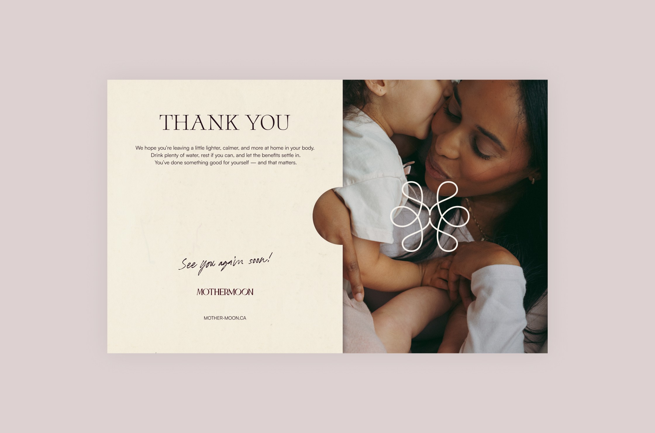
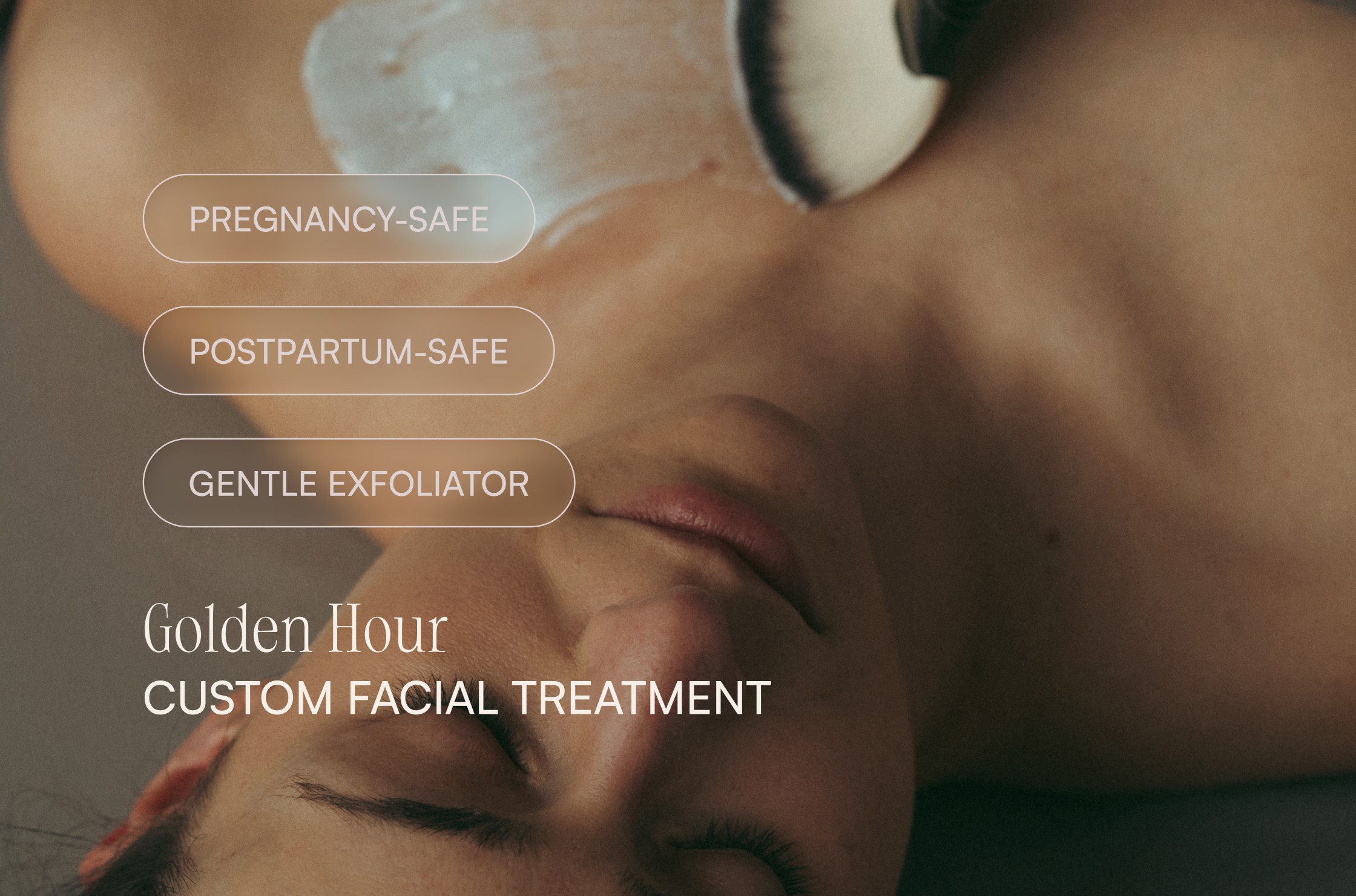
The visual direction was built to feel chic and elevated without intimidation. The identity balances calm, muted tones with warmth and very subtle lunar references, creating a sense of restoration without drifting into cliché.
Design decisions focused on:
– Clear hierarchy and typography
– Warm, grounded colour palette
– Editorial-style visuals
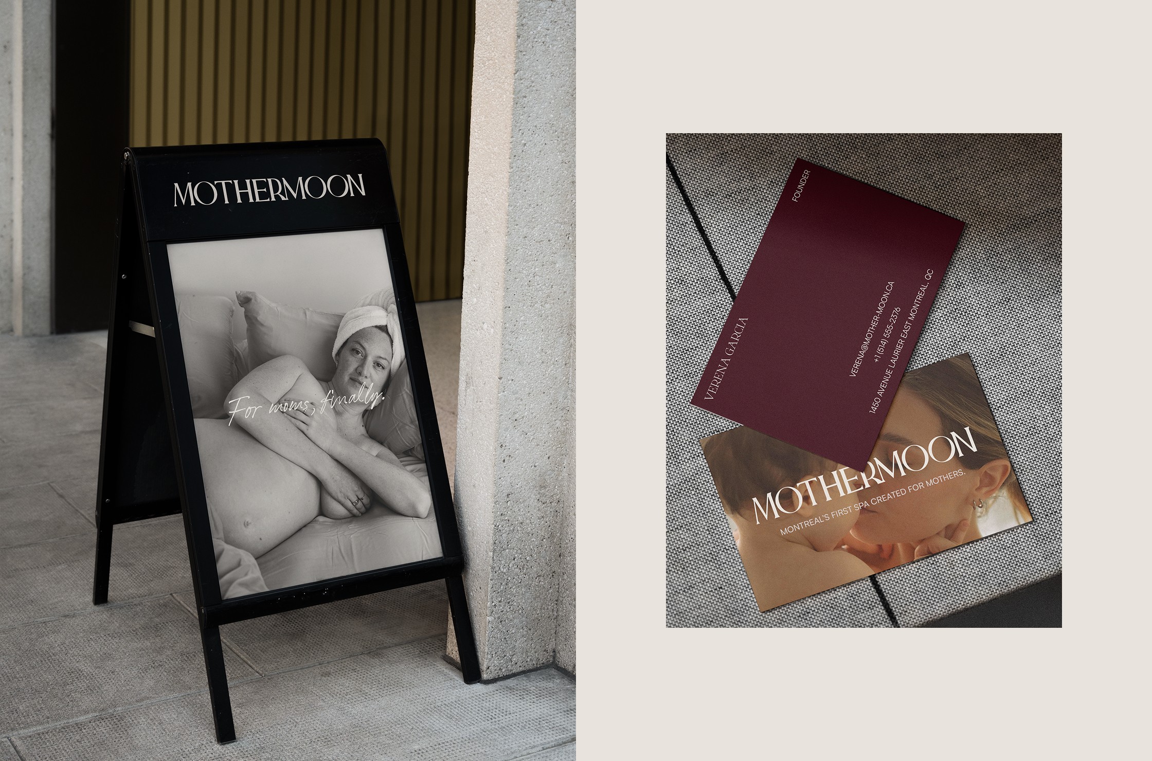
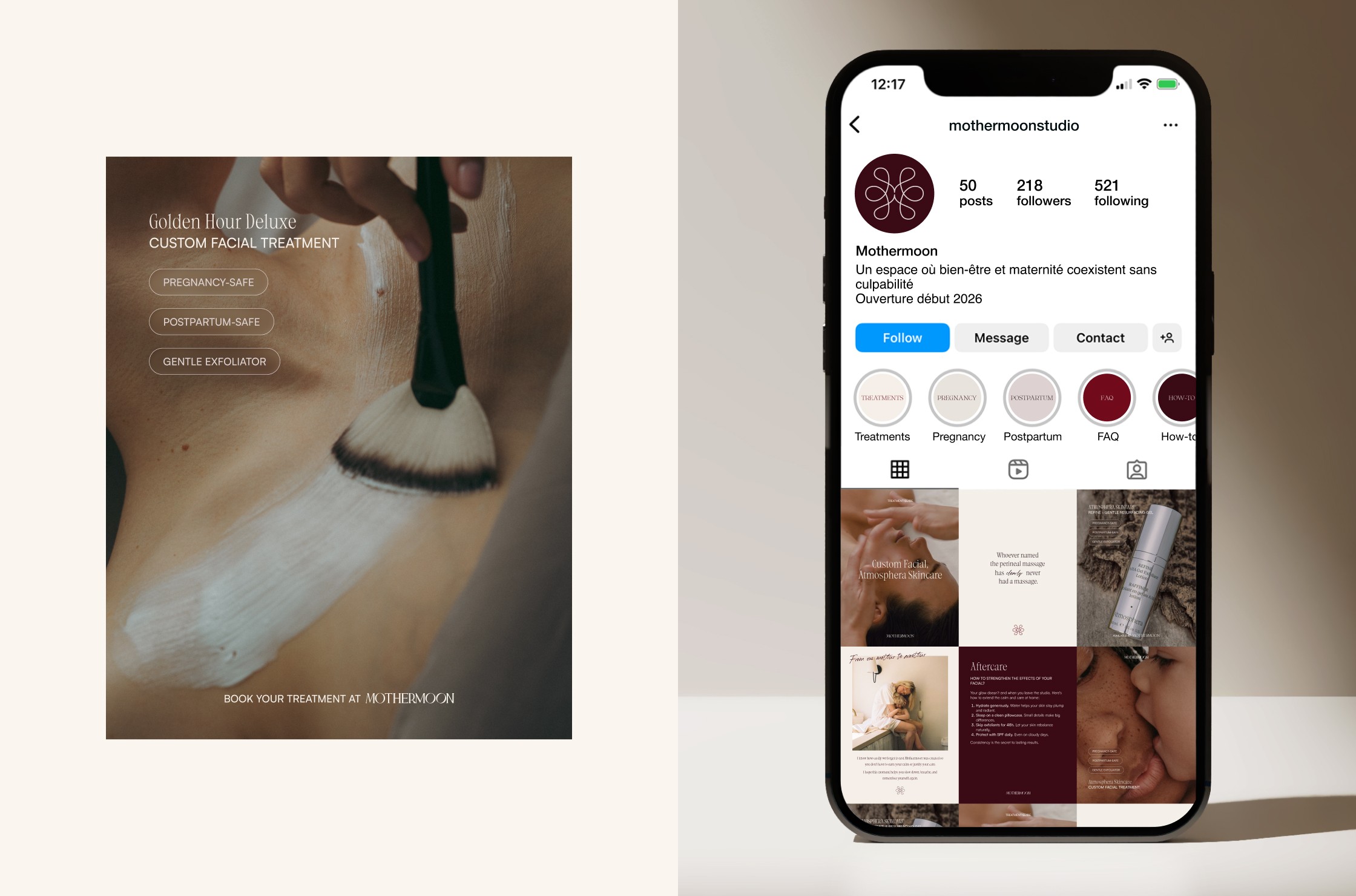
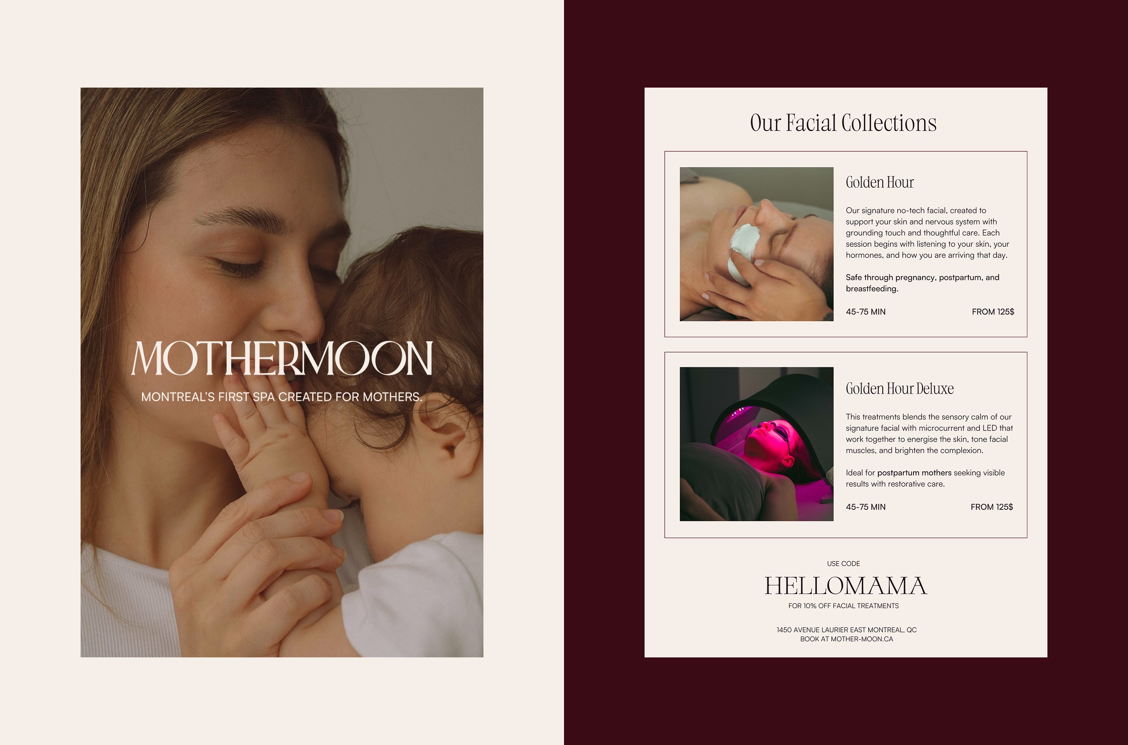
– A system flexible enough to live across digital, print, and physical space
Every detail was designed to communicate safety, clarity, and care—without over-explaining or overwhelming.
Website & Digital Experience
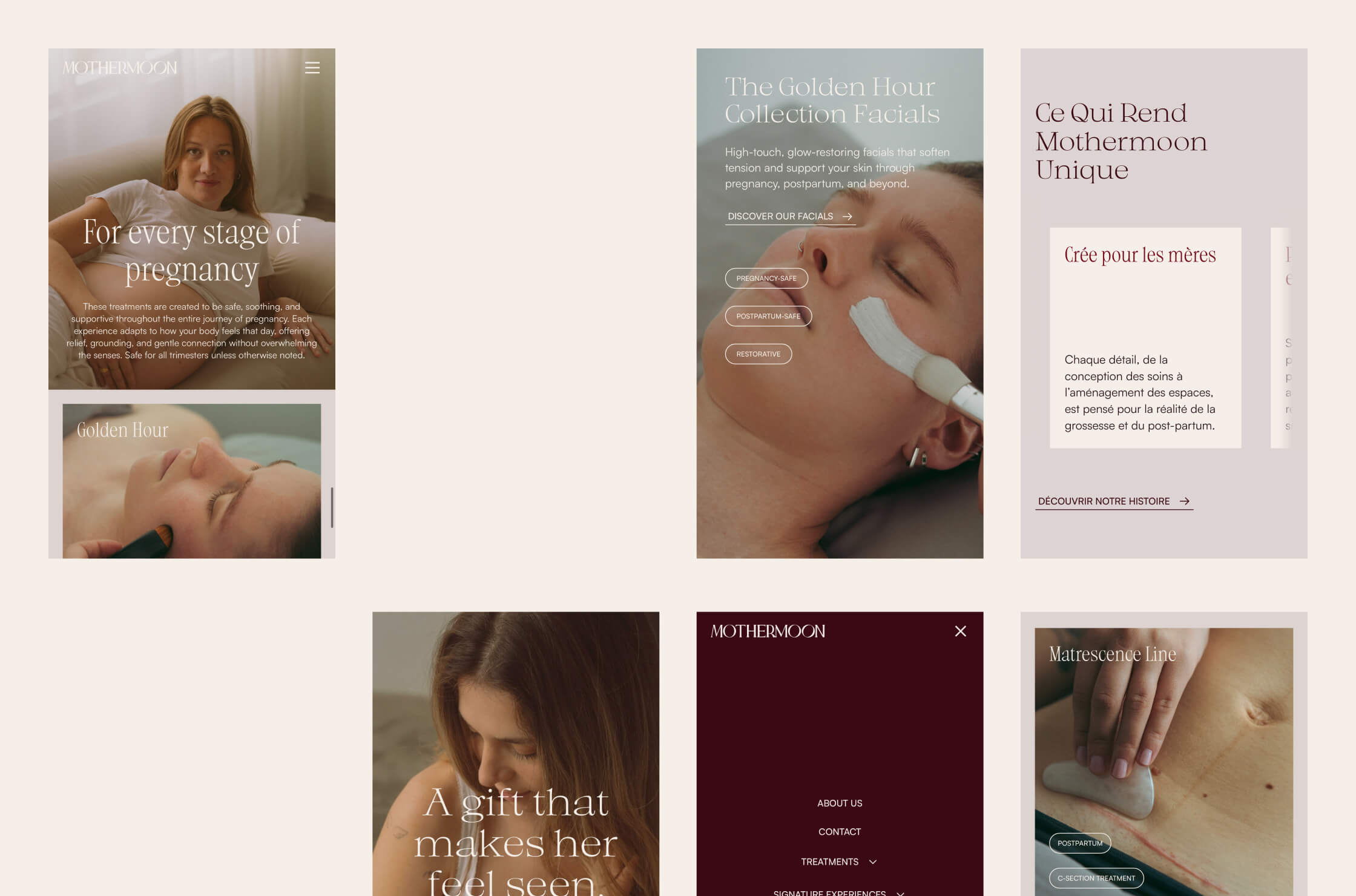
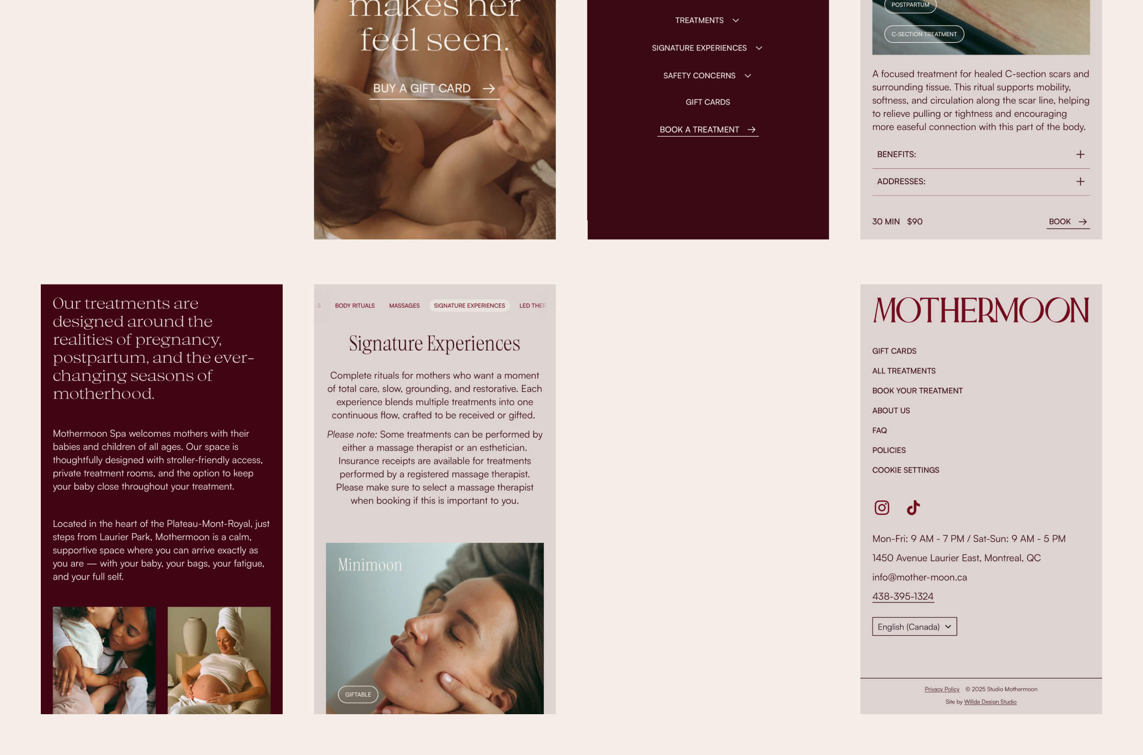
We designed and developed the Mothermoon website using Framer, including advanced CMS logic to support stage-specific treatments, with clear safety information, educational content, and future growth.
The website functions as:
– A reassurance tool for mothers researching what’s safe
– A frictionless, mobile-first booking experience
– A storytelling platform that clearly communicates the brand’s values
We wrote the website copy to be clear and empathetic. The language speaks directly to mothers’ realities, removing doubt and mental load rather than adding to it.
Social media templates and additional digital and print collateral were also developed to support launch and ongoing communication.
THE OUTCOME
Mothermoon launched with a cohesive, confident brand and a digital experience designed to support mothers from the very first interaction. The strategy now guides everything from services and messaging to community-building and long-term growth plans.
The founder felt supported, understood, and confident throughout the process, describing the collaboration as a key part of building the business—not just the brand.
Mothermoon now stands as a clear, differentiated presence in the wellness space, positioned to grow into a category-defining brand for mothers.
Wellness & Spa
B2C
Launch
challenge
Create a brand, message, and digital experience for a spa designed specifically for mothers—addressing pregnancy, postpartum, and the emotional realities of motherhood in a way no existing competitor did.
solution
Brand Strategy & Positioning
Visual Identity
Website Design
Website Development
Copywriting
Print & Digital Collateral
Social Media Templates
impact
A beautiful, emotionally intelligent brand that launched with confidence and immediate impact. Mothermoon entered the market with a strong identity, a seamless booking experience, and a foundation designed for long-term growth and community.
Mothermoon Studio
read full case study
Branding a category-defining wellness spa designed for mothers
A strategy-led brand, digital experience, and launch platform for a spa built around the realities of motherhood.
THE CHALLENGE
Verena, the founder of Mothermoon, reached out while preparing to launch a wellness spa created specifically for mothers. She had a vision to build a space that finally puts mothers at the centre of wellness, without guilt, judgement, or logistical barriers.
The challenge was to define an entirely new category. Existing spas in the market focused on beauty, relaxation, or luxury, but none spoke clearly and directly to pregnancy, postpartum, or the emotional realities of motherhood. Mothermoon needed a brand that felt premium and special, while remaining deeply empathetic and restorative. The experience had to work both emotionally and operationally—from messaging and booking to in-space experience.
OUR APPROACH
This was a full-scope collaboration covering brand strategy, creative direction, identity, copywriting, and website design and development.
We started with an in-depth strategy phase to define Mothermoon’s positioning, audience, and long-term vision. The goal was to create clarity and confidence at every touchpoint, allowing Verena to launch with a strong foundation rather than guessing her way forward.
Brand Strategy & Positioning
At the core of the strategy was one clear idea:
A wellness spa for (overwhelmed) mothers that removes the guilt and barriers of self-care.
We defined Mothermoon as a category-defining space that:
– Prioritises pregnancy- and postpartum-safe treatments
– Welcomes babies, removing the biggest barrier to self-care
– Combines expertise with empathy
– Treats rest as a necessity, not an indulgence
The brand was positioned around three promises:
– Belonging – a space designed emotionally and practically for mothers
– Restoration – treatments that genuinely support physical and mental recovery
– Authenticity – honest, relatable communication grounded in real motherhood
Extensive audience work mapped three key groups: first-time mothers, experienced mothers, and gifters. Each group required different reassurance, messaging, and decision triggers, all of which informed the brand voice, website structure, and booking experience.
Visual Identity & Creative Direction
The visual direction was built to feel chic and elevated without intimidation. The identity balances calm, muted tones with warmth and very subtle lunar references, creating a sense of restoration without drifting into cliché.
Design decisions focused on:
– Clear hierarchy and typography
– Warm, grounded colour palette
– Editorial-style visuals
– A system flexible enough to live across digital, print, and physical space
Every detail was designed to communicate safety, clarity, and care—without over-explaining or overwhelming.
Website & Digital Experience
We designed and developed the Mothermoon website using Framer, including advanced CMS logic to support stage-specific treatments, with clear safety information, educational content, and future growth.
The website functions as:
– A reassurance tool for mothers researching what’s safe
– A frictionless, mobile-first booking experience
– A storytelling platform that clearly communicates the brand’s values
We wrote the website copy to be clear and empathetic. The language speaks directly to mothers’ realities, removing doubt and mental load rather than adding to it.
Social media templates and additional digital and print collateral were also developed to support launch and ongoing communication.
THE OUTCOME
Mothermoon launched with a cohesive, confident brand and a digital experience designed to support mothers from the very first interaction. The strategy now guides everything from services and messaging to community-building and long-term growth plans.
The founder felt supported, understood, and confident throughout the process, describing the collaboration as a key part of building the business—not just the brand.
Mothermoon now stands as a clear, differentiated presence in the wellness space, positioned to grow into a category-defining brand for mothers.
Wellness & Spa
B2C
Launch
challenge
Create a brand, message, and digital experience for a spa designed specifically for mothers—addressing pregnancy, postpartum, and the emotional realities of motherhood in a way no existing competitor did.
solution
Brand Strategy & Positioning
Visual Identity
Website Design
Website Development
Copywriting
Print & Digital Collateral
Social Media Templates
impact
A beautiful, emotionally intelligent brand that launched with confidence and immediate impact. Mothermoon entered the market with a strong identity, a seamless booking experience, and a foundation designed for long-term growth and community.
Mothermoon Studio
Branding a category-defining wellness spa designed for mothers
read full case study
A strategy-led brand, digital experience, and launch platform for a spa built around the realities of motherhood.
THE CHALLENGE
Verena, the founder of Mothermoon, reached out while preparing to launch a wellness spa created specifically for mothers. She had a vision to build a space that finally puts mothers at the centre of wellness, without guilt, judgement, or logistical barriers.
The challenge was to define an entirely new category. Existing spas in the market focused on beauty, relaxation, or luxury, but none spoke clearly and directly to pregnancy, postpartum, or the emotional realities of motherhood. Mothermoon needed a brand that felt premium and special, while remaining deeply empathetic and restorative. The experience had to work both emotionally and operationally—from messaging and booking to in-space experience.
OUR APPROACH
This was a full-scope collaboration covering brand strategy, creative direction, identity, copywriting, and website design and development.
We started with an in-depth strategy phase to define Mothermoon’s positioning, audience, and long-term vision. The goal was to create clarity and confidence at every touchpoint, allowing Verena to launch with a strong foundation rather than guessing her way forward.
Brand Strategy & Positioning
At the core of the strategy was one clear idea:
A wellness spa for (overwhelmed) mothers that removes the guilt and barriers of self-care.
We defined Mothermoon as a category-defining space that:
– Prioritises pregnancy- and postpartum-safe treatments
– Welcomes babies, removing the biggest barrier to self-care
– Combines expertise with empathy
– Treats rest as a necessity, not an indulgence
The brand was positioned around three promises:
– Belonging – a space designed emotionally and practically for mothers
– Restoration – treatments that genuinely support physical and mental recovery
– Authenticity – honest, relatable communication grounded in real motherhood
Extensive audience work mapped three key groups: first-time mothers, experienced mothers, and gifters. Each group required different reassurance, messaging, and decision triggers, all of which informed the brand voice, website structure, and booking experience.
Visual Identity & Creative Direction
The visual direction was built to feel chic and elevated without intimidation. The identity balances calm, muted tones with warmth and very subtle lunar references, creating a sense of restoration without drifting into cliché.
Design decisions focused on:
– Clear hierarchy and typography
– Warm, grounded colour palette
– Editorial-style visuals
– A system flexible enough to live across digital, print, and physical space
Every detail was designed to communicate safety, clarity, and care—without over-explaining or overwhelming.
Website & Digital Experience
We designed and developed the Mothermoon website using Framer, including advanced CMS logic to support stage-specific treatments, with clear safety information, educational content, and future growth.
The website functions as:
– A reassurance tool for mothers researching what’s safe
– A frictionless, mobile-first booking experience
– A storytelling platform that clearly communicates the brand’s values
We wrote the website copy to be clear and empathetic. The language speaks directly to mothers’ realities, removing doubt and mental load rather than adding to it.
Social media templates and additional digital and print collateral were also developed to support launch and ongoing communication.
THE OUTCOME
Mothermoon launched with a cohesive, confident brand and a digital experience designed to support mothers from the very first interaction. The strategy now guides everything from services and messaging to community-building and long-term growth plans.
The founder felt supported, understood, and confident throughout the process, describing the collaboration as a key part of building the business—not just the brand.
Mothermoon now stands as a clear, differentiated presence in the wellness space, positioned to grow into a category-defining brand for mothers.
Wellness & Spa
B2C
Launch
challenge
Create a brand, message, and digital experience for a spa designed specifically for mothers—addressing pregnancy, postpartum, and the emotional realities of motherhood in a way no existing competitor did.
solution
Brand Strategy & Positioning
Visual Identity
Website Design
Website Development
Copywriting
Print & Digital Collateral
Social Media Templates
impact
A beautiful, emotionally intelligent brand that launched with confidence and immediate impact. Mothermoon entered the market with a strong identity, a seamless booking experience, and a foundation designed for long-term growth and community.


In the client’s words
“Weronika led a clear and well-structured branding and website process from start to finish. Through in-depth research and thoughtful brand strategy, she developed an identity that perfectly reflects our positioning and values. The templates, systems, and website she delivered are not only beautiful but easy to use in practice, with strong copy and carefully chosen imagery. Communication was smooth and reliable throughout, even with a 6 hour time difference.”
“Weronika led a clear and well-structured branding and website process from start to finish. Through in-depth research and thoughtful brand strategy, she developed an identity that perfectly reflects our positioning and values. The templates, systems, and website she delivered are not only beautiful but easy to use in practice, with strong copy and carefully chosen imagery. Communication was smooth and reliable throughout, even with a 6 hour time difference.”
Verena
— Founder, Mothermoon
See more of our work


Let’s discuss your project!