
IAK
read full case study
From scattered pieces to an activewear label Brand World built around listening
How we gave a Toronto activewear label the visual system its philosophy already had — built to carry one hero product today into the full line still ahead.
THE CHALLENGE
Isha launched IAK with a hero product but a placeholder identity from a previous designer who had never delivered proper files or a cohesive system. Her logo read as hard and masculine — the opposite of where she was taking IAK. Less than a year in, she was patching the gaps herself.
Her product philosophy was clear: that the body is intelligent, and recovery is not something to optimise away. We needed to build a Brand World to hold that vision, and flexible enough to grow from a single product into a full activewear line built around bio-ceramic, far-infrared fabric — still some time out in R&D. Isha looked for a studio that could help her define the brand she was building, not just the product she’d already shipped.
OUR APPROACH
This was a full-scope collaboration covering brand strategy, visual identity, illustration and pattern development, brand guidelines, and a full suite of print and digital collateral.
Brand Strategy & Positioning
Strategy had to hold two things at once — grounded, peer-reviewed material science, and a soft, sovereign feeling in a category built almost entirely around performance and body-checking. The brand’s north star:
For women who have stopped performing fitness and started listening to their bodies, IAK is the bio-ceramic activewear brand that merges peer-reviewed recovery technology with considered, founder-led design — so they never have to choose between how it works and how it makes them feel.
From there, amongst other strategic elements, we defined three pillars for how the brand would show up: material intelligence (bio-ceramic, FIR-backed fabric treated as the hero), considered form (pieces designed to hold their place in a wardrobe, not just a gym bag), and founder-led community (built in public, with Isha visible at every touchpoint).
We also developed IAK's taglines. "Activewear that listens" — naming the product and how it responds to the body, and a design philosophy. Alongside it, a secondary line, "Closer to the body, further from the noise," sets IAK against the performance-tracking noise of the category.
Visual Identity & Creative Direction
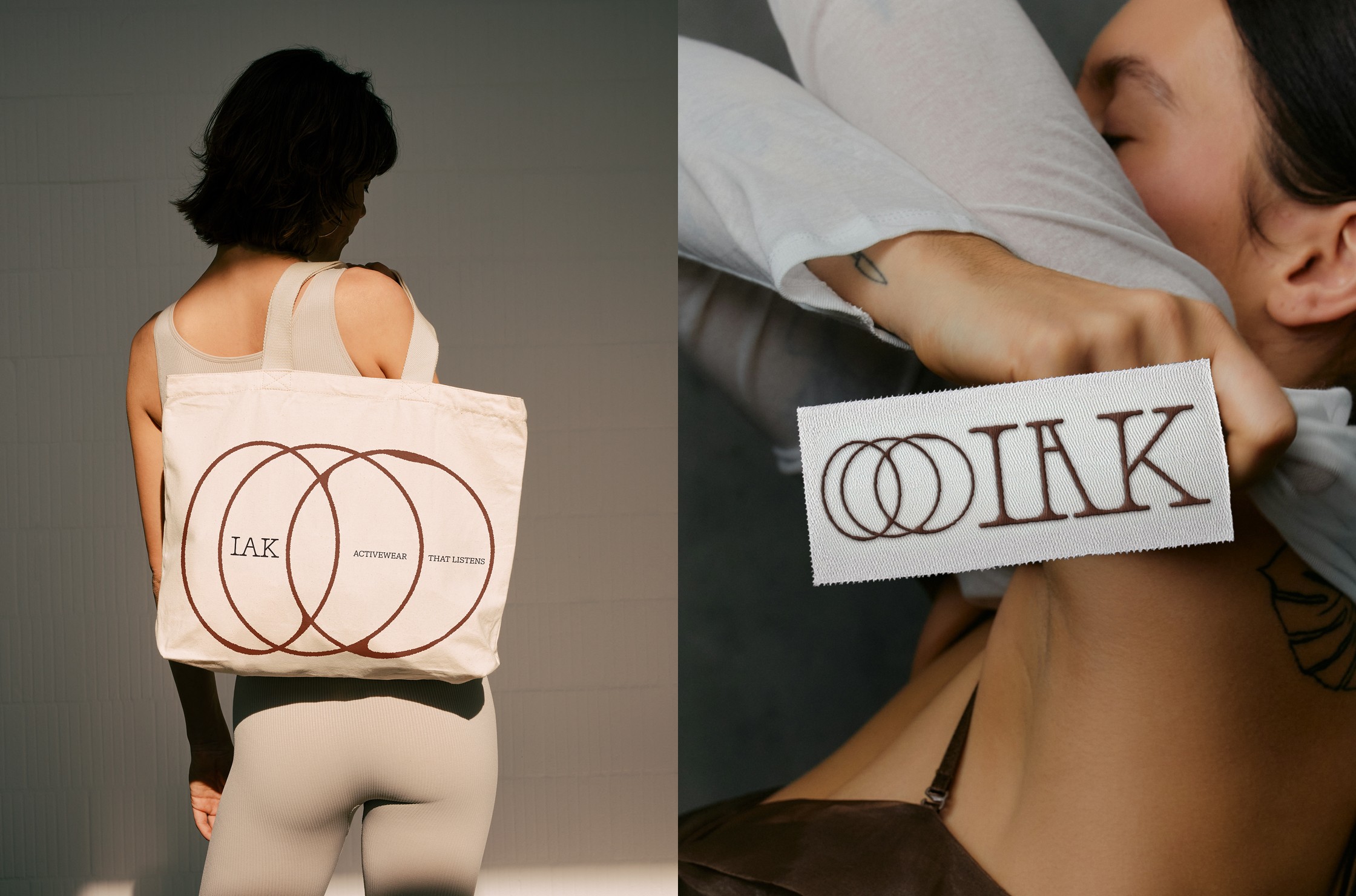
The identity pulled inspiration from the language of ingredient labels and old apothecary formula cards – precise, named, and traceable – delivered with warmth instead of clinical distance. We built IAK’s custom logo suite: softened, characteristic letterforms for the wordmarks, and brand marks distilled from the same signal-and-frequency thinking behind the pattern work.
The identity is supported by a warm and grounded colour palette built to move fluidly across packaging, digital, and print alike. Typography followed the same instinct using a technical rounded slab serif serif for headlines set against a quieter sans serif.
A recurring illustrated pattern, referencing the body’s own signals, carries the brand from a hangtag to a highlight cover.
Collateral & Brand System
The brief was never just logo design — it was to design a system Isha and her team could run day to day without a designer in the room. That meant clear brand guidelines and a full digital template kit covering social media and newsletter designs, an interactive email signature, and the physical pieces that carry the product line into the world: hang tag, insert card, mailer, and sock sleeve packaging.
Design was only part of it — we supported Isha through the unglamorous groundwork behind it, from sourcing typeface licensing to dielines and pointing her toward the right print vendors.
THE OUTCOME
Isha had been sitting with IAK’s branding for a long time before we started, patching pieces together herself. Getting it right meant real collaboration, and understanding with how much she cared about every detail – we never treat that care as “difficult”.
What came out of it was a complete system: strategy, identity, brand guidelines, and the full suite of collateral, from social templates to sock-sleeve packaging, built to work as a whole and not as separate pieces.
Activewear
D2C
Rebranding
challenge
An activewear label with a hero product and big vision, held back by a placeholder identity that read as hard and masculine and with no visual system to carry it into the full activewear line.
solution
Brand Strategy & Positioning
Visual Identity
Illustration & Pattern
Social Media Templates
Packaging
Digital & Print Collateral
impact
A brand system built to scale and take IAK from one product to a full activewear line on the same foundation. In a category crowded with performance-tracking sameness, IAK now stands apart from the wellness clichés.
IAK
read full case study
From scattered pieces to an activewear label Brand World built around listening
How we gave a Toronto activewear label the visual system its philosophy already had — built to carry one hero product today into the full line still ahead.
THE CHALLENGE
Isha launched IAK with a hero product but a placeholder identity from a previous designer who had never delivered proper files or a cohesive system. Her logo read as hard and masculine — the opposite of where she was taking IAK. Less than a year in, she was patching the gaps herself.
Her product philosophy was clear: that the body is intelligent, and recovery is not something to optimise away. We needed to build a Brand World to hold that vision, and flexible enough to grow from a single product into a full activewear line built around bio-ceramic, far-infrared fabric — still some time out in R&D. Isha looked for a studio that could help her define the brand she was building, not just the product she’d already shipped.
OUR APPROACH
This was a full-scope collaboration covering brand strategy, visual identity, illustration and pattern development, brand guidelines, and a full suite of print and digital collateral.
Brand Strategy & Positioning
Strategy had to hold two things at once — grounded, peer-reviewed material science, and a soft, sovereign feeling in a category built almost entirely around performance and body-checking. The brand’s north star:
For women who have stopped performing fitness and started listening to their bodies, IAK is the bio-ceramic activewear brand that merges peer-reviewed recovery technology with considered, founder-led design — so they never have to choose between how it works and how it makes them feel.
From there, amongst other strategic elements, we defined three pillars for how the brand would show up: material intelligence (bio-ceramic, FIR-backed fabric treated as the hero), considered form (pieces designed to hold their place in a wardrobe, not just a gym bag), and founder-led community (built in public, with Isha visible at every touchpoint).
We also developed IAK's taglines. "Activewear that listens" — naming the product and how it responds to the body, and a design philosophy. Alongside it, a secondary line, "Closer to the body, further from the noise," sets IAK against the performance-tracking noise of the category.
Visual Identity & Creative Direction
The identity pulled inspiration from the language of ingredient labels and old apothecary formula cards – precise, named, and traceable – delivered with warmth instead of clinical distance. We built IAK’s custom logo suite: softened, characteristic letterforms for the wordmarks, and brand marks distilled from the same signal-and-frequency thinking behind the pattern work.
The identity is supported by a warm and grounded colour palette built to move fluidly across packaging, digital, and print alike. Typography followed the same instinct using a technical rounded slab serif serif for headlines set against a quieter sans serif.
A recurring illustrated pattern, referencing the body’s own signals, carries the brand from a hangtag to a highlight cover.
Collateral & Brand System
The brief was never just logo design — it was to design a system Isha and her team could run day to day without a designer in the room. That meant clear brand guidelines and a full digital template kit covering social media and newsletter designs, an interactive email signature, and the physical pieces that carry the product line into the world: hang tag, insert card, mailer, and sock sleeve packaging.
Design was only part of it — we supported Isha through the unglamorous groundwork behind it, from sourcing typeface licensing to dielines and pointing her toward the right print vendors.
THE OUTCOME
Isha had been sitting with IAK’s branding for a long time before we started, patching pieces together herself. Getting it right meant real collaboration, and understanding with how much she cared about every detail – we never treat that care as “difficult”.
What came out of it was a complete system: strategy, identity, brand guidelines, and the full suite of collateral, from social templates to sock-sleeve packaging, built to work as a whole and not as separate pieces.
Activewear
D2C
Rebranding
challenge
An activewear label with a hero product and big vision, held back by a placeholder identity that read as hard and masculine and with no visual system to carry it into the full activewear line.
solution
Brand Strategy & Positioning
Visual Identity
Illustration & Pattern
Social Media Templates
Packaging
Digital & Print Collateral
impact
A brand system built to scale and take IAK from one product to a full activewear line on the same foundation. In a category crowded with performance-tracking sameness, IAK now stands apart from the wellness clichés.
IAK
From scattered pieces to an activewear label Brand World built around listening
read full case study
How we gave a Toronto activewear label the visual system its philosophy already had — built to carry one hero product today into the full line still ahead.
THE CHALLENGE
Isha launched IAK with a hero product but a placeholder identity from a previous designer who had never delivered proper files or a cohesive system. Her logo read as hard and masculine — the opposite of where she was taking IAK. Less than a year in, she was patching the gaps herself.
Her product philosophy was clear: that the body is intelligent, and recovery is not something to optimise away. We needed to build a Brand World to hold that vision, and flexible enough to grow from a single product into a full activewear line built around bio-ceramic, far-infrared fabric — still some time out in R&D. Isha looked for a studio that could help her define the brand she was building, not just the product she’d already shipped.
OUR APPROACH
This was a full-scope collaboration covering brand strategy, visual identity, illustration and pattern development, brand guidelines, and a full suite of print and digital collateral.
Brand Strategy & Positioning
Strategy had to hold two things at once — grounded, peer-reviewed material science, and a soft, sovereign feeling in a category built almost entirely around performance and body-checking. The brand’s north star:
For women who have stopped performing fitness and started listening to their bodies, IAK is the bio-ceramic activewear brand that merges peer-reviewed recovery technology with considered, founder-led design — so they never have to choose between how it works and how it makes them feel.
From there, amongst other strategic elements, we defined three pillars for how the brand would show up: material intelligence (bio-ceramic, FIR-backed fabric treated as the hero), considered form (pieces designed to hold their place in a wardrobe, not just a gym bag), and founder-led community (built in public, with Isha visible at every touchpoint).
We also developed IAK's taglines. "Activewear that listens" — naming the product and how it responds to the body, and a design philosophy. Alongside it, a secondary line, "Closer to the body, further from the noise," sets IAK against the performance-tracking noise of the category.
Visual Identity & Creative Direction
The identity pulled inspiration from the language of ingredient labels and old apothecary formula cards – precise, named, and traceable – delivered with warmth instead of clinical distance. We built IAK’s custom logo suite: softened, characteristic letterforms for the wordmarks, and brand marks distilled from the same signal-and-frequency thinking behind the pattern work.
The identity is supported by a warm and grounded colour palette built to move fluidly across packaging, digital, and print alike. Typography followed the same instinct using a technical rounded slab serif serif for headlines set against a quieter sans serif.
A recurring illustrated pattern, referencing the body’s own signals, carries the brand from a hangtag to a highlight cover.
Collateral & Brand System
The brief was never just logo design — it was to design a system Isha and her team could run day to day without a designer in the room. That meant clear brand guidelines and a full digital template kit covering social media and newsletter designs, an interactive email signature, and the physical pieces that carry the product line into the world: hang tag, insert card, mailer, and sock sleeve packaging.
Design was only part of it — we supported Isha through the unglamorous groundwork behind it, from sourcing typeface licensing to dielines and pointing her toward the right print vendors.
THE OUTCOME
Isha had been sitting with IAK’s branding for a long time before we started, patching pieces together herself. Getting it right meant real collaboration, and understanding with how much she cared about every detail – we never treat that care as “difficult”.
What came out of it was a complete system: strategy, identity, brand guidelines, and the full suite of collateral, from social templates to sock-sleeve packaging, built to work as a whole and not as separate pieces.
Activewear
D2C
Rebranding
challenge
An activewear label with a hero product and big vision, held back by a placeholder identity that read as hard and masculine and with no visual system to carry it into the full activewear line.
solution
Brand Strategy & Positioning
Visual Identity
Illustration & Pattern
Social Media Templates
Packaging
Digital & Print Collateral
impact
A brand system built to scale and take IAK from one product to a full activewear line on the same foundation. In a category crowded with performance-tracking sameness, IAK now stands apart from the wellness clichés.




In the client’s words
“IAK had a name, a product, and a philosophy, but no real visual identity that matched how considered the brand actually was. Everything felt slightly disconnected. The packaging didn't match the product, the product didn't match the story. Weronika built an actual system out of it, all of it working together. For the first time, IAK looks the way it's always felt to me.”
“IAK had a name, a product, and a philosophy, but no real visual identity that matched how considered the brand actually was. Everything felt slightly disconnected. The packaging didn't match the product, the product didn't match the story. Weronika built an actual system out of it, all of it working together. For the first time, IAK looks the way it's always felt to me.”
Isha Kharbanda
— Founder, IAK
See more of our work


Let’s discuss your project!