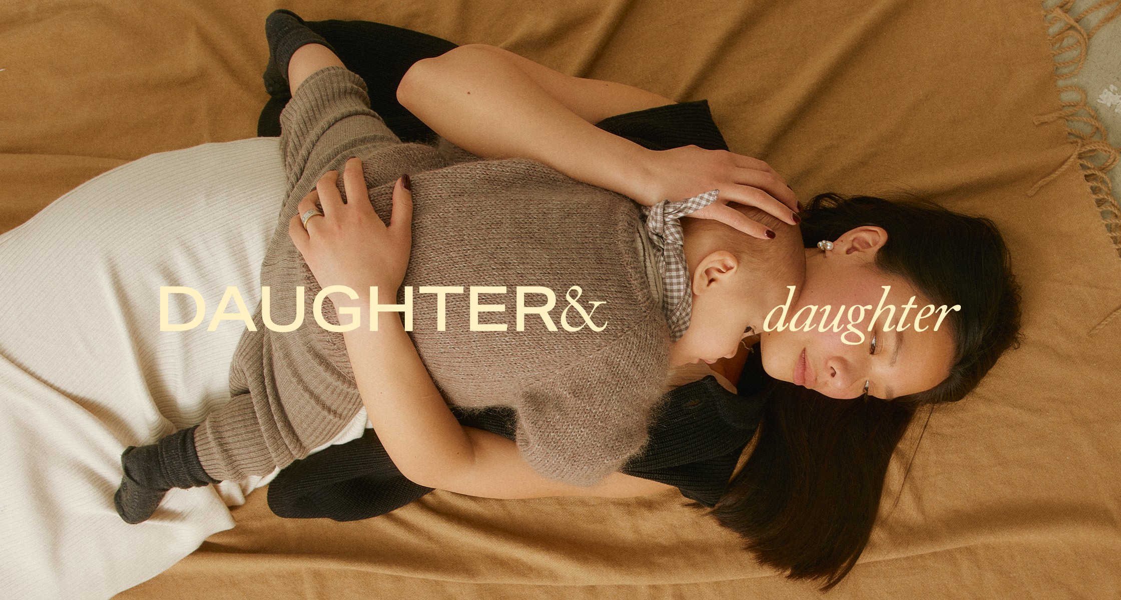
Daughter&Daughter
read full case study
Branding a thoughtful journal brand that makes space for real life
A premium, emotionally intelligent identity for a pre-launch brand supporting personal growth, mental clarity, and modern motherhood.
THE CHALLENGE
Daughter&Daughter came to me as a pre-launch brand with a goal to create high-quality guided journals and planners that support new mothers, busy professionals, and mindfulness seekers. The challenge was to define the entire brand from scratch, including naming, strategy, visual identity, web design, copy, packaging, and digital assets, and build a brand world that felt premium but grounded, energetic but calm.
The founder wanted to reflect the emotional weight of her personal journey into motherhood, without making it overly sentimental or niche. The brand had to feel supportive, real, and aspirational without falling into lifestyle clichés. It also had to clearly differentiate itself from existing planner brands, many of which leaned either too clinical or overly whimsical.
OUR APPROACH
This was a full-scope, collaborative process built on clarity and intention. We started with brand strategy and naming, before moving into visual identity, tone of voice, product design, and digital execution.
Strategy & Naming
Through detailed workshops and deep research, we defined the core of the brand around three pillars:
– Empowering personal growth
– Prioritising well-being
– Celebrating motherhood
After exploring over 100 naming options, we landed on Daughter&Daughter. The name is deeply personal to the founder and emotionally resonant for her audience. It captures the duality of being a mother and a daughter, the generational impact of care, and the reflective nature of the brand.
Visual Identity
The visual system was built to reflect contrast and balance:
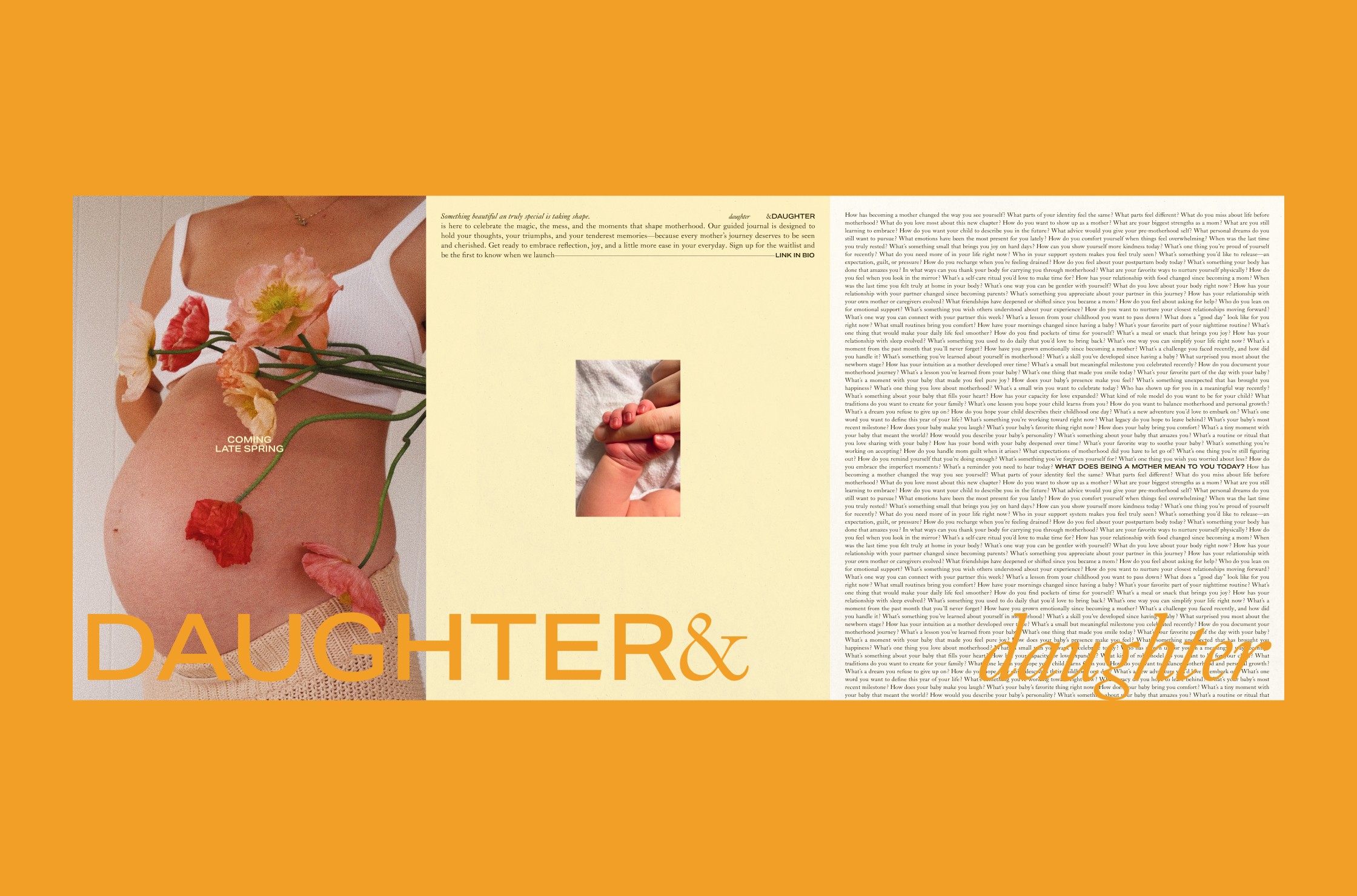
– A logotype combining contrasting wide sans serif and elegant serif set in italics, a nod to how different we all are, and how those differences belong side-by-side
– A subdued, earthy palette with a pop of warm orange to bring energy without overwhelming the calm
– Editorial typography and plenty of white space to create a feeling of quality and calm
– Packaging that feels like a gift, designed to hold emotional weight as much as product value
Copywriting & Tone
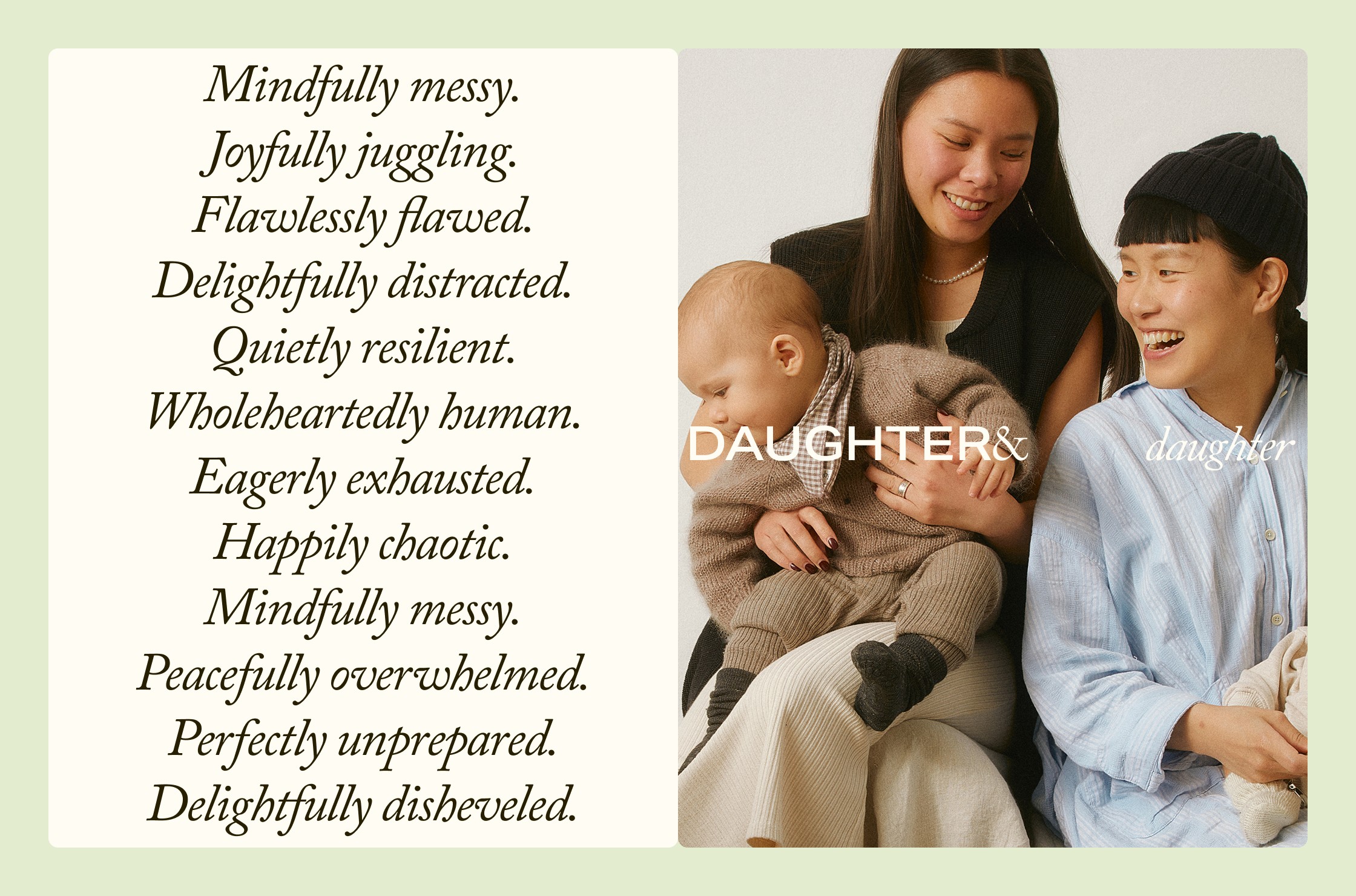
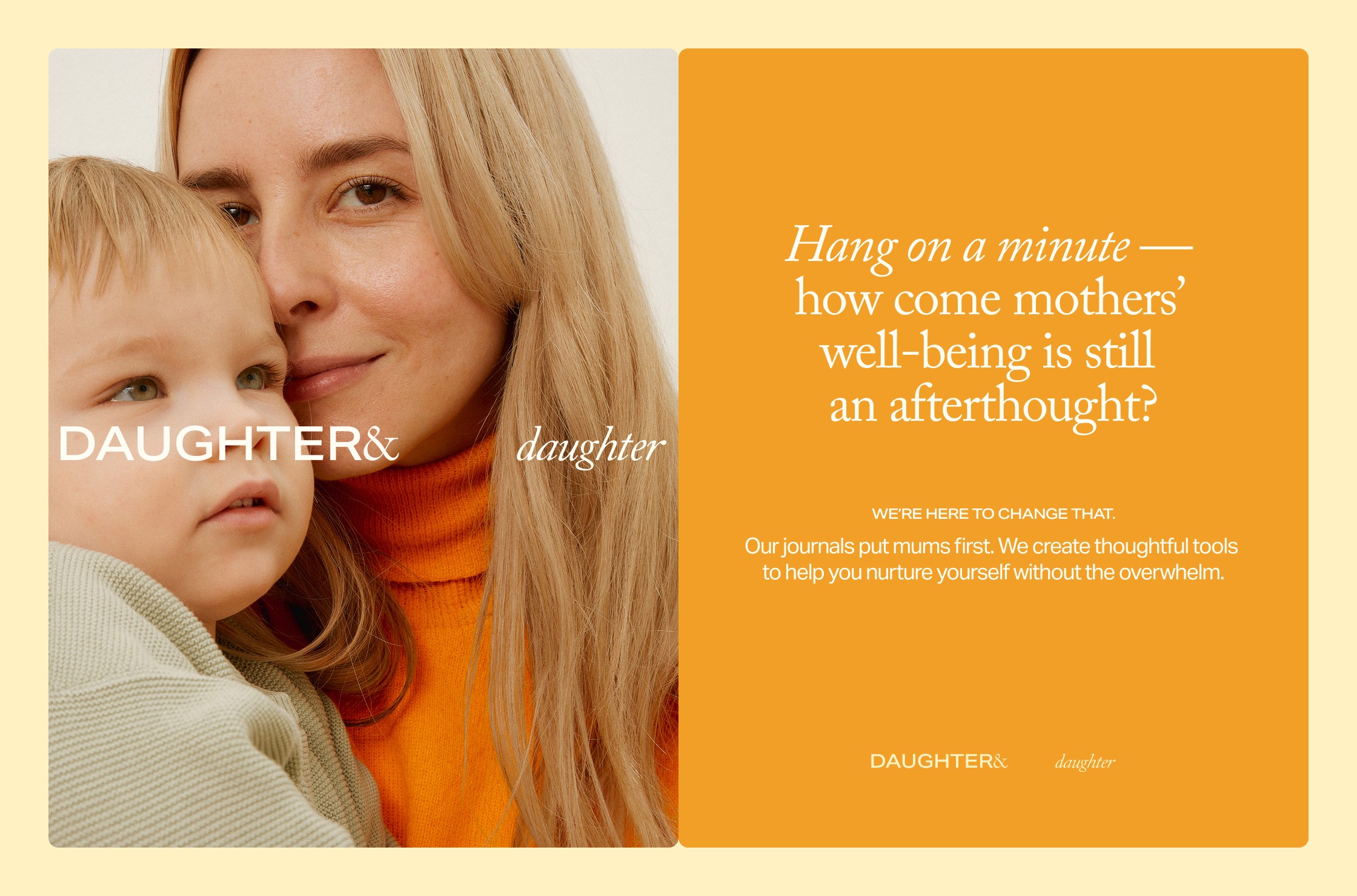
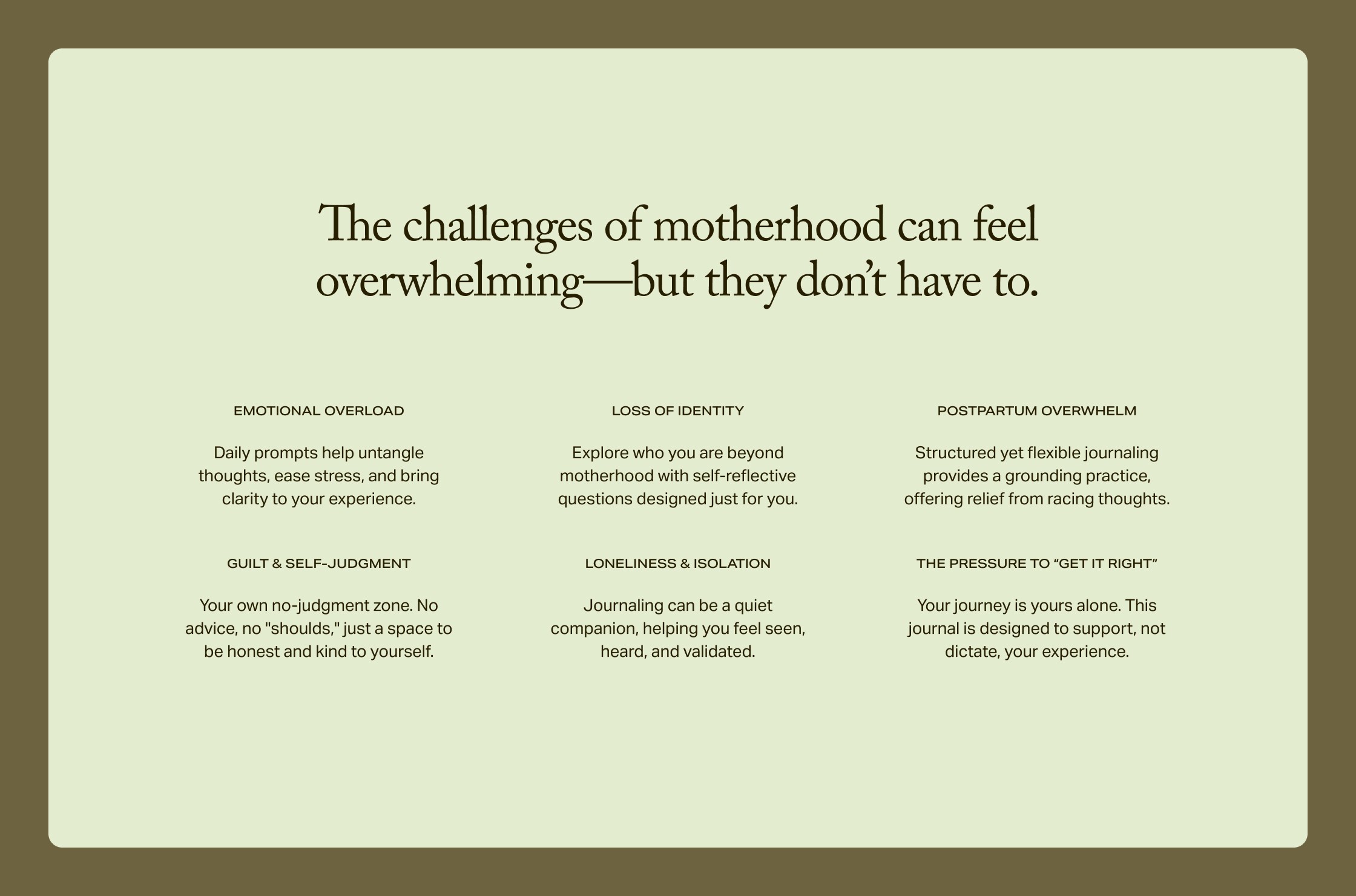
We crafted a voice that’s clear, punchy, and emotionally smart. Not overly sweet or polished, more like a friend who gets it.
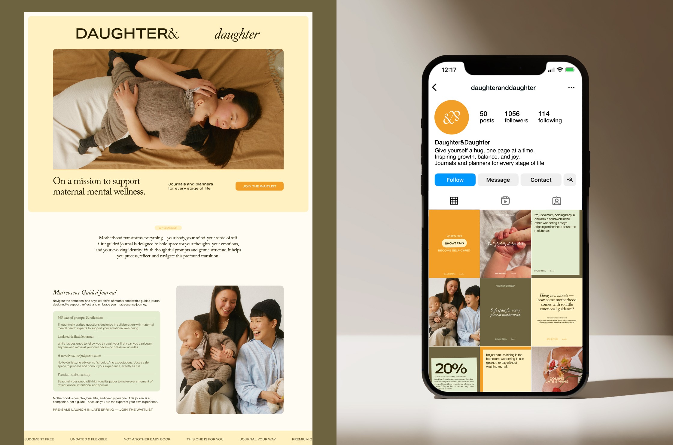
“Hang on a minute — how come motherhood comes with so little emotional guidance?”
“I’m just a mum, holding a baby in one arm, a sandwich in the other, wondering if mayo dripping on her head counts as moisturiser.”
This tone runs through every touchpoint, from web to email to product details.
Web & Social
To support a pre-sale and email capture campaign, we designed a simple, premium website that introduced the brand and encouraged signups. Social templates and creative direction were also delivered to help build early visibility across paid and organic social channels.
THE OUTCOME
Daughter&Daughter is preparing to launch with a cohesive, high-quality brand that reflects the emotional intelligence, design sensitivity, and personal story behind it. The identity and tone are already being used to build an engaged early audience, with strong emotional resonance in the brand’s messaging and visual presence.
The work created a solid foundation for both product launch and long-term growth giving the founder the clarity and creative tools she needed to step confidently into the market.
Wellness & Parenting
D2C
Pre-launch
challenge
Create a full brand identity, name, tone of voice, and digital presence for a premium journal brand rooted in mindfulness, motherhood, and personal growth designed to feel supportive, real, and aspirational.
solution
Naming
Brand Strategy
Visual Identity
Product Design
Copywriting
Website Design
Social Media Templates
impact
A thoughtful, complete brand identity that’s emotionally engaging and ready to scale. The brand is already resonating with its audience through email and social, and launch preparations are in full swing with a clear, confident creative direction.
Daughter&Daughter
read full case study
Branding a thoughtful journal brand that makes space for real life
A premium, emotionally intelligent identity for a pre-launch brand supporting personal growth, mental clarity, and modern motherhood.
THE CHALLENGE
Daughter&Daughter came to me as a pre-launch brand with a goal to create high-quality guided journals and planners that support new mothers, busy professionals, and mindfulness seekers. The challenge was to define the entire brand from scratch, including naming, strategy, visual identity, web design, copy, packaging, and digital assets, and build a brand world that felt premium but grounded, energetic but calm.
The founder wanted to reflect the emotional weight of her personal journey into motherhood, without making it overly sentimental or niche. The brand had to feel supportive, real, and aspirational without falling into lifestyle clichés. It also had to clearly differentiate itself from existing planner brands, many of which leaned either too clinical or overly whimsical.
OUR APPROACH
This was a full-scope, collaborative process built on clarity and intention. We started with brand strategy and naming, before moving into visual identity, tone of voice, product design, and digital execution.
Strategy & Naming
Through detailed workshops and deep research, we defined the core of the brand around three pillars:
– Empowering personal growth
– Prioritising well-being
– Celebrating motherhood
After exploring over 100 naming options, we landed on Daughter&Daughter. The name is deeply personal to the founder and emotionally resonant for her audience. It captures the duality of being a mother and a daughter, the generational impact of care, and the reflective nature of the brand.
Visual Identity
The visual system was built to reflect contrast and balance:
– A logotype combining contrasting wide sans serif and elegant serif set in italics, a nod to how different we all are, and how those differences belong side-by-side
– A subdued, earthy palette with a pop of warm orange to bring energy without overwhelming the calm
– Editorial typography and plenty of white space to create a feeling of quality and calm
– Packaging that feels like a gift, designed to hold emotional weight as much as product value
Copywriting & Tone
We crafted a voice that’s clear, punchy, and emotionally smart. Not overly sweet or polished, more like a friend who gets it.
“Hang on a minute — how come motherhood comes with so little emotional guidance?”
“I’m just a mum, holding a baby in one arm, a sandwich in the other, wondering if mayo dripping on her head counts as moisturiser.”
This tone runs through every touchpoint, from web to email to product details.
Web & Social
To support a pre-sale and email capture campaign, we designed a simple, premium website that introduced the brand and encouraged signups. Social templates and creative direction were also delivered to help build early visibility across paid and organic social channels.
THE OUTCOME
Daughter&Daughter is preparing to launch with a cohesive, high-quality brand that reflects the emotional intelligence, design sensitivity, and personal story behind it. The identity and tone are already being used to build an engaged early audience, with strong emotional resonance in the brand’s messaging and visual presence.
The work created a solid foundation for both product launch and long-term growth giving the founder the clarity and creative tools she needed to step confidently into the market.
Wellness & Parenting
D2C
Pre-launch
challenge
Create a full brand identity, name, tone of voice, and digital presence for a premium journal brand rooted in mindfulness, motherhood, and personal growth designed to feel supportive, real, and aspirational.
solution
Naming
Brand Strategy
Visual Identity
Product Design
Copywriting
Website Design
Social Media Templates
impact
A thoughtful, complete brand identity that’s emotionally engaging and ready to scale. The brand is already resonating with its audience through email and social, and launch preparations are in full swing with a clear, confident creative direction.
Daughter&Daughter
Branding a thoughtful journal brand that makes space for real life
read full case study
A premium, emotionally intelligent identity for a pre-launch brand supporting personal growth, mental clarity, and modern motherhood.
THE CHALLENGE
Daughter&Daughter came to me as a pre-launch brand with a goal to create high-quality guided journals and planners that support new mothers, busy professionals, and mindfulness seekers. The challenge was to define the entire brand from scratch, including naming, strategy, visual identity, web design, copy, packaging, and digital assets, and build a brand world that felt premium but grounded, energetic but calm.
The founder wanted to reflect the emotional weight of her personal journey into motherhood, without making it overly sentimental or niche. The brand had to feel supportive, real, and aspirational without falling into lifestyle clichés. It also had to clearly differentiate itself from existing planner brands, many of which leaned either too clinical or overly whimsical.
OUR APPROACH
This was a full-scope, collaborative process built on clarity and intention. We started with brand strategy and naming, before moving into visual identity, tone of voice, product design, and digital execution.
Strategy & Naming
Through detailed workshops and deep research, we defined the core of the brand around three pillars:
– Empowering personal growth
– Prioritising well-being
– Celebrating motherhood
After exploring over 100 naming options, we landed on Daughter&Daughter. The name is deeply personal to the founder and emotionally resonant for her audience. It captures the duality of being a mother and a daughter, the generational impact of care, and the reflective nature of the brand.
Visual Identity
The visual system was built to reflect contrast and balance:
– A logotype combining contrasting wide sans serif and elegant serif set in italics, a nod to how different we all are, and how those differences belong side-by-side
– A subdued, earthy palette with a pop of warm orange to bring energy without overwhelming the calm
– Editorial typography and plenty of white space to create a feeling of quality and calm
– Packaging that feels like a gift, designed to hold emotional weight as much as product value
Copywriting & Tone
We crafted a voice that’s clear, punchy, and emotionally smart. Not overly sweet or polished, more like a friend who gets it.
“Hang on a minute — how come motherhood comes with so little emotional guidance?”
“I’m just a mum, holding a baby in one arm, a sandwich in the other, wondering if mayo dripping on her head counts as moisturiser.”
This tone runs through every touchpoint, from web to email to product details.
Web & Social
To support a pre-sale and email capture campaign, we designed a simple, premium website that introduced the brand and encouraged signups. Social templates and creative direction were also delivered to help build early visibility across paid and organic social channels.
THE OUTCOME
Daughter&Daughter is preparing to launch with a cohesive, high-quality brand that reflects the emotional intelligence, design sensitivity, and personal story behind it. The identity and tone are already being used to build an engaged early audience, with strong emotional resonance in the brand’s messaging and visual presence.
The work created a solid foundation for both product launch and long-term growth giving the founder the clarity and creative tools she needed to step confidently into the market.
Wellness & Parenting
D2C
Pre-launch
challenge
Create a full brand identity, name, tone of voice, and digital presence for a premium journal brand rooted in mindfulness, motherhood, and personal growth designed to feel supportive, real, and aspirational.
solution
Naming
Brand Strategy
Visual Identity
Product Design
Copywriting
Website Design
Social Media Templates
impact
A thoughtful, complete brand identity that’s emotionally engaging and ready to scale. The brand is already resonating with its audience through email and social, and launch preparations are in full swing with a clear, confident creative direction.



See more of our work


Let’s discuss your project!