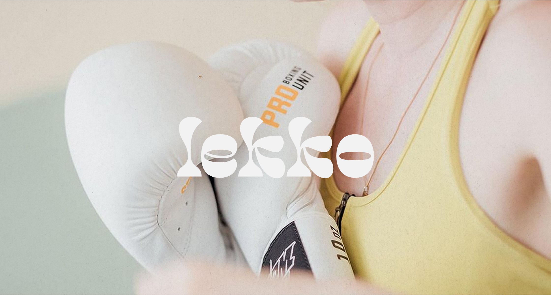
Lekko athletics
read full case study
Branding a boutique fitness studio that balances strength with mindfulness
A brand identity that blends clarity, inclusivity, and intention—designed for a modern, community-driven fitness space.
THE CHALLENGE
When Paulina set out to build a boutique fitness studio where strength training meets mindfulness. A space that supports, not intimidates. She needed branding that would reflect this balance: professional but soft, strong but inviting.
As a new business, Lekko needed to stand out from a sea of overly intense, high-testosterone gym brands, while still signalling quality, results, and expertise. The brand had to appeal across genders and fitness levels, and offer a clear sense of belonging.
OUR APPROACH
We worked together during a one-week Design Intensive, structured around three focused design days and a strategy-led kickoff session.
We started by defining the brand’s strategic foundations: its personality, positioning, values, and tone. From there, we crafted a visual identity that balanced modernity with warmth, and structure with softness.
Key elements:
– A refined, gender-neutral colour palette
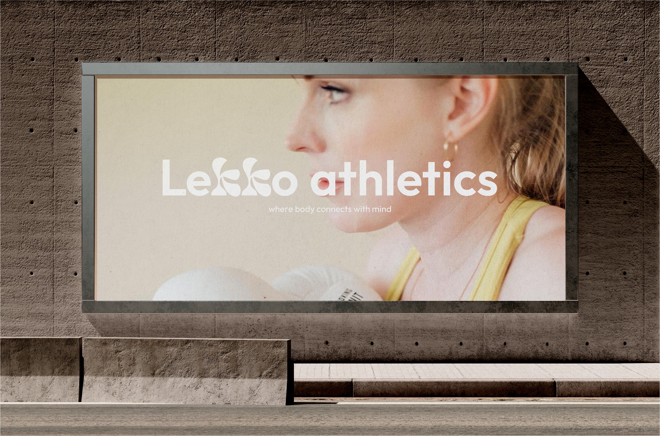
– A flexible logo system for digital, print, and physical applications
– Typography chosen for its clean, grounded energy
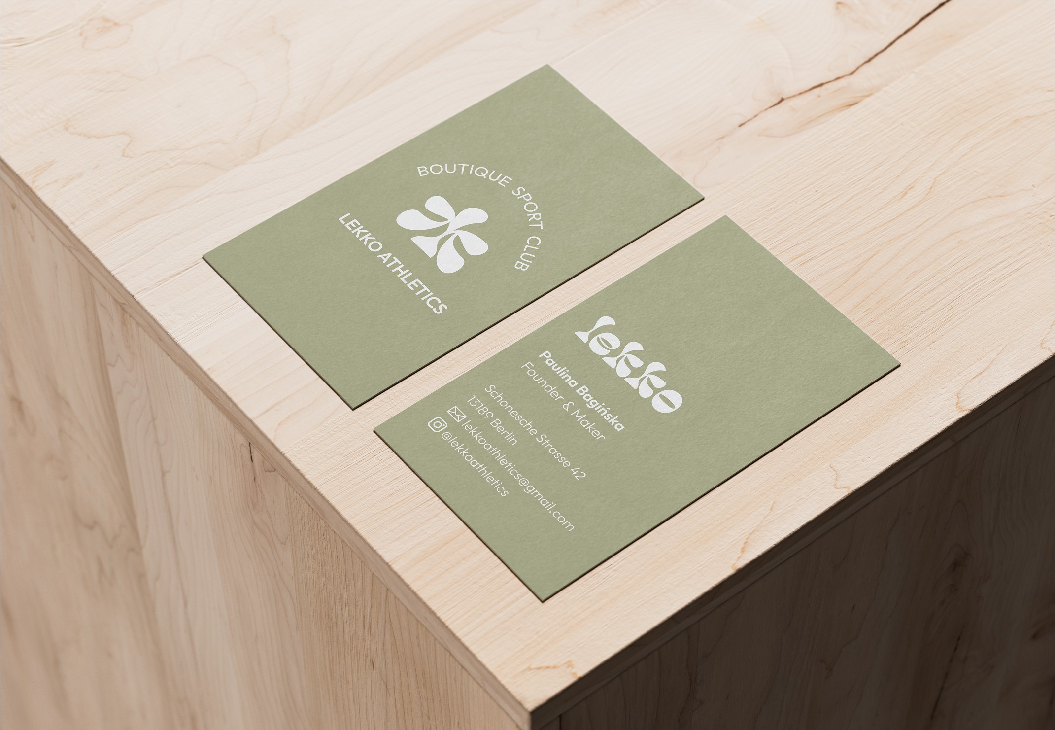
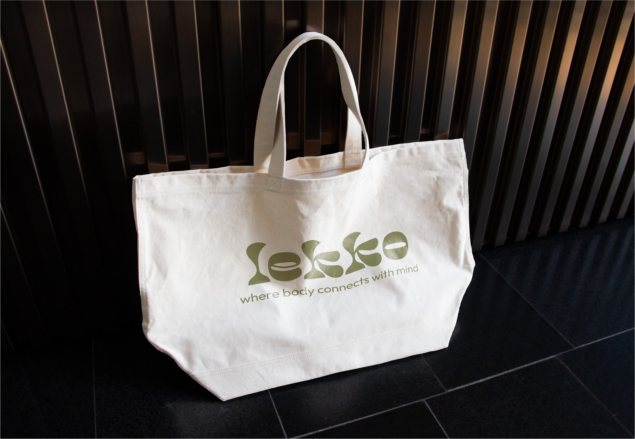
– Simple yet impactful collateral assets for early brand rollout
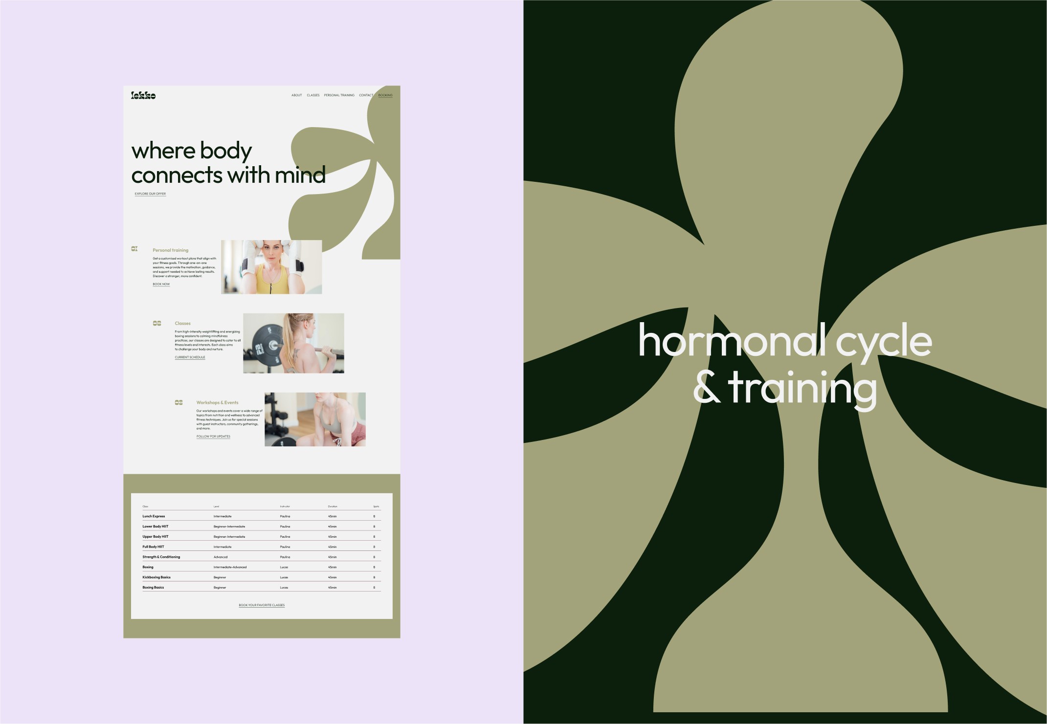
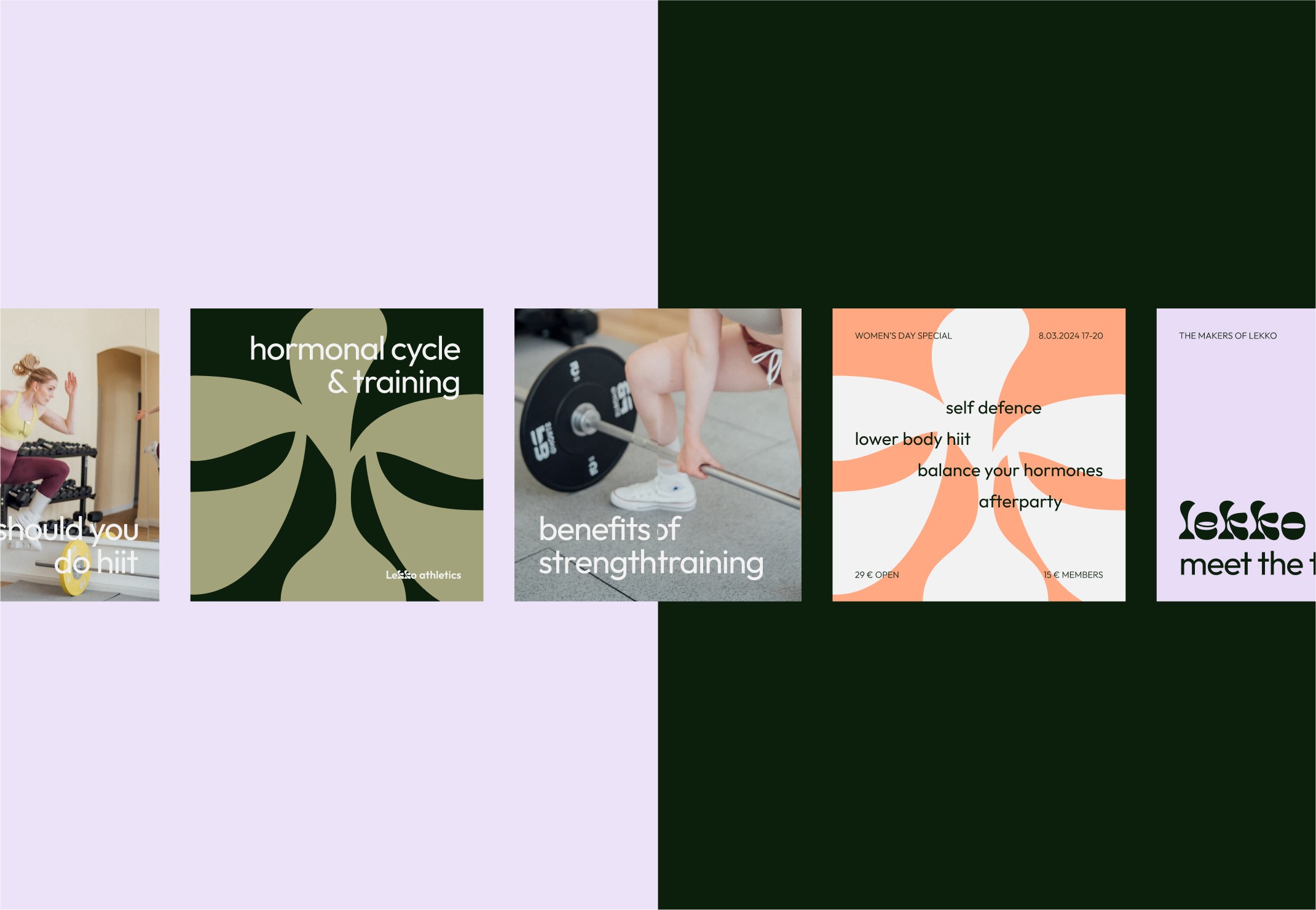
To give the client a sense of future possibilities, I also designed a conceptual website and social templates—bonus assets not part of the original scope but developed to showcase how the brand could scale with intention.
THE OUTCOME
Lekko Athletics launched with a brand that feels bold and grounded, designed to welcome a broad, inclusive audience without diluting its message. The studio now uses the identity across touchpoints, and the foundation we created continues to shape how the business grows its physical and digital presence.
This project proves that even short, focused engagements can deliver clarity, cohesion, and a real sense of momentum.
Fitness & Wellness
B2C
Brand Launch
challenge
Create an identity that merges strength and mindfulness while remaining gender-neutral, non-intimidating, and visually distinct from typical gym branding.
solution
Brand Strategy
Visual Identity
Collateral Suite
Art Direction
impact
A professional, approachable identity now in active use. Lekko launched with a clear brand foundation that resonates with its audience and reflects the studio’s values and vision for long-term growth.
Lekko athletics
read full case study
Branding a boutique fitness studio that balances strength with mindfulness
A brand identity that blends clarity, inclusivity, and intention—designed for a modern, community-driven fitness space.
THE CHALLENGE
When Paulina set out to build a boutique fitness studio where strength training meets mindfulness. A space that supports, not intimidates. She needed branding that would reflect this balance: professional but soft, strong but inviting.
As a new business, Lekko needed to stand out from a sea of overly intense, high-testosterone gym brands, while still signalling quality, results, and expertise. The brand had to appeal across genders and fitness levels, and offer a clear sense of belonging.
OUR APPROACH
We worked together during a one-week Design Intensive, structured around three focused design days and a strategy-led kickoff session.
We started by defining the brand’s strategic foundations: its personality, positioning, values, and tone. From there, we crafted a visual identity that balanced modernity with warmth, and structure with softness.
Key elements:
– A refined, gender-neutral colour palette
– A flexible logo system for digital, print, and physical applications
– Typography chosen for its clean, grounded energy
– Simple yet impactful collateral assets for early brand rollout
To give the client a sense of future possibilities, I also designed a conceptual website and social templates—bonus assets not part of the original scope but developed to showcase how the brand could scale with intention.
THE OUTCOME
Lekko Athletics launched with a brand that feels bold and grounded, designed to welcome a broad, inclusive audience without diluting its message. The studio now uses the identity across touchpoints, and the foundation we created continues to shape how the business grows its physical and digital presence.
This project proves that even short, focused engagements can deliver clarity, cohesion, and a real sense of momentum.
Fitness & Wellness
B2C
Brand Launch
challenge
Create an identity that merges strength and mindfulness while remaining gender-neutral, non-intimidating, and visually distinct from typical gym branding.
solution
Brand Strategy
Visual Identity
Collateral Suite
Art Direction
impact
A professional, approachable identity now in active use. Lekko launched with a clear brand foundation that resonates with its audience and reflects the studio’s values and vision for long-term growth.
Lekko athletics
Branding a boutique fitness studio that balances strength with mindfulness
read full case study
A brand identity that blends clarity, inclusivity, and intention—designed for a modern, community-driven fitness space.
THE CHALLENGE
When Paulina set out to build a boutique fitness studio where strength training meets mindfulness. A space that supports, not intimidates. She needed branding that would reflect this balance: professional but soft, strong but inviting.
As a new business, Lekko needed to stand out from a sea of overly intense, high-testosterone gym brands, while still signalling quality, results, and expertise. The brand had to appeal across genders and fitness levels, and offer a clear sense of belonging.
OUR APPROACH
We worked together during a one-week Design Intensive, structured around three focused design days and a strategy-led kickoff session.
We started by defining the brand’s strategic foundations: its personality, positioning, values, and tone. From there, we crafted a visual identity that balanced modernity with warmth, and structure with softness.
Key elements:
– A refined, gender-neutral colour palette
– A flexible logo system for digital, print, and physical applications
– Typography chosen for its clean, grounded energy
– Simple yet impactful collateral assets for early brand rollout
To give the client a sense of future possibilities, I also designed a conceptual website and social templates—bonus assets not part of the original scope but developed to showcase how the brand could scale with intention.
THE OUTCOME
Lekko Athletics launched with a brand that feels bold and grounded, designed to welcome a broad, inclusive audience without diluting its message. The studio now uses the identity across touchpoints, and the foundation we created continues to shape how the business grows its physical and digital presence.
This project proves that even short, focused engagements can deliver clarity, cohesion, and a real sense of momentum.
Fitness & Wellness
B2C
Brand Launch
challenge
Create an identity that merges strength and mindfulness while remaining gender-neutral, non-intimidating, and visually distinct from typical gym branding.
solution
Brand Strategy
Visual Identity
Collateral Suite
Art Direction
impact
A professional, approachable identity now in active use. Lekko launched with a clear brand foundation that resonates with its audience and reflects the studio’s values and vision for long-term growth.



See more of our work


Let’s discuss your project!