Narąbane & Naprute
read full case study
Branding a bold, dual-crafted home decor brand for millennials & gen Z
A vibrant, purpose-led identity system for two sister brands empowering renters to personalise their homes.
THE CHALLENGE
Łucja launched Narąbane (woodworking) and Naprute (embroidery) to bring more character and colour into the homes of Millennials and Gen Z. Her goal was to offer home decor that felt bold, affordable, and expressive without relying on mass production.
She needed two visual identities that could stand on their own, while still feeling like part of the same ecosystem. The brands had to appeal to a younger audience in rented spaces, communicate quality without looking overly polished, and reflect her values as a founder. Łucja’s own story—leaving behind burnout and corporate culture—was an important part of the brand energy too.
OUR APPROACH
This was a full-scope project that included brand strategy, visual identity, and web design. We started by defining the market positioning and customer mindset. Many of Łucja’s future customers were creative, design-aware, and used to adapting their homes on a budget. They wanted cheeky decor that made a statement, even in small or rented spaces.
Strategy
We focused on shaping a brand world that felt confident and fun. Instead of following minimal trends or overly “crafted” aesthetics, we leaned into colour, personality, and clarity. Both brands needed to be strong on their own while sharing a visual rhythm that tied them together.
Visual Identity
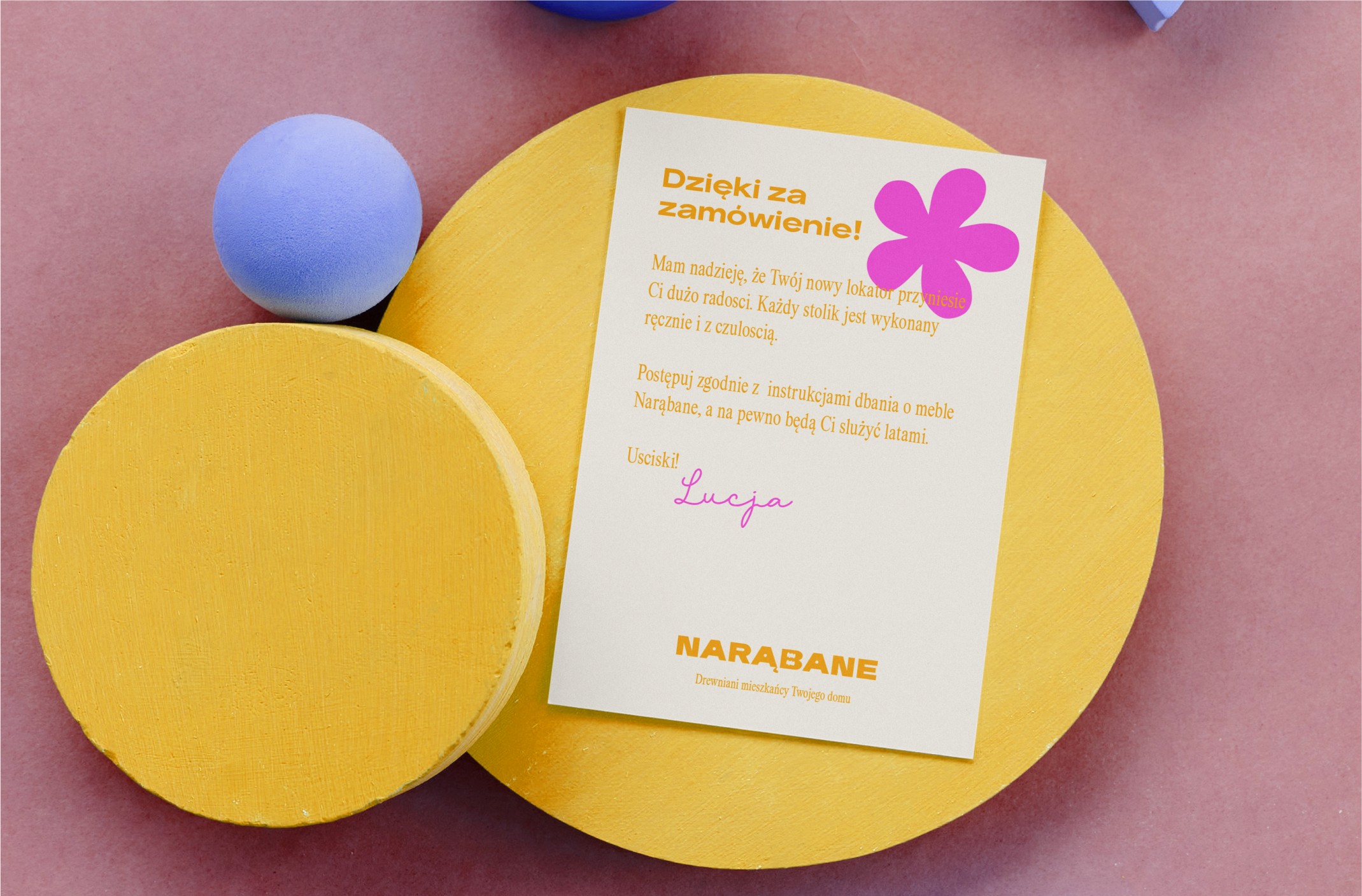
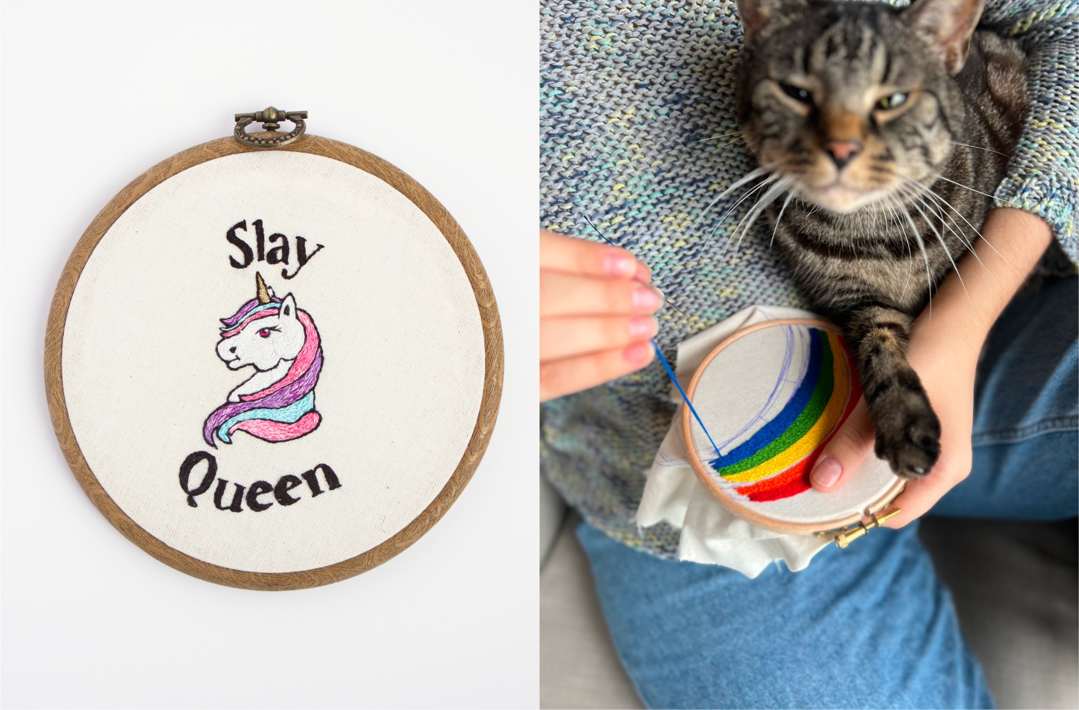
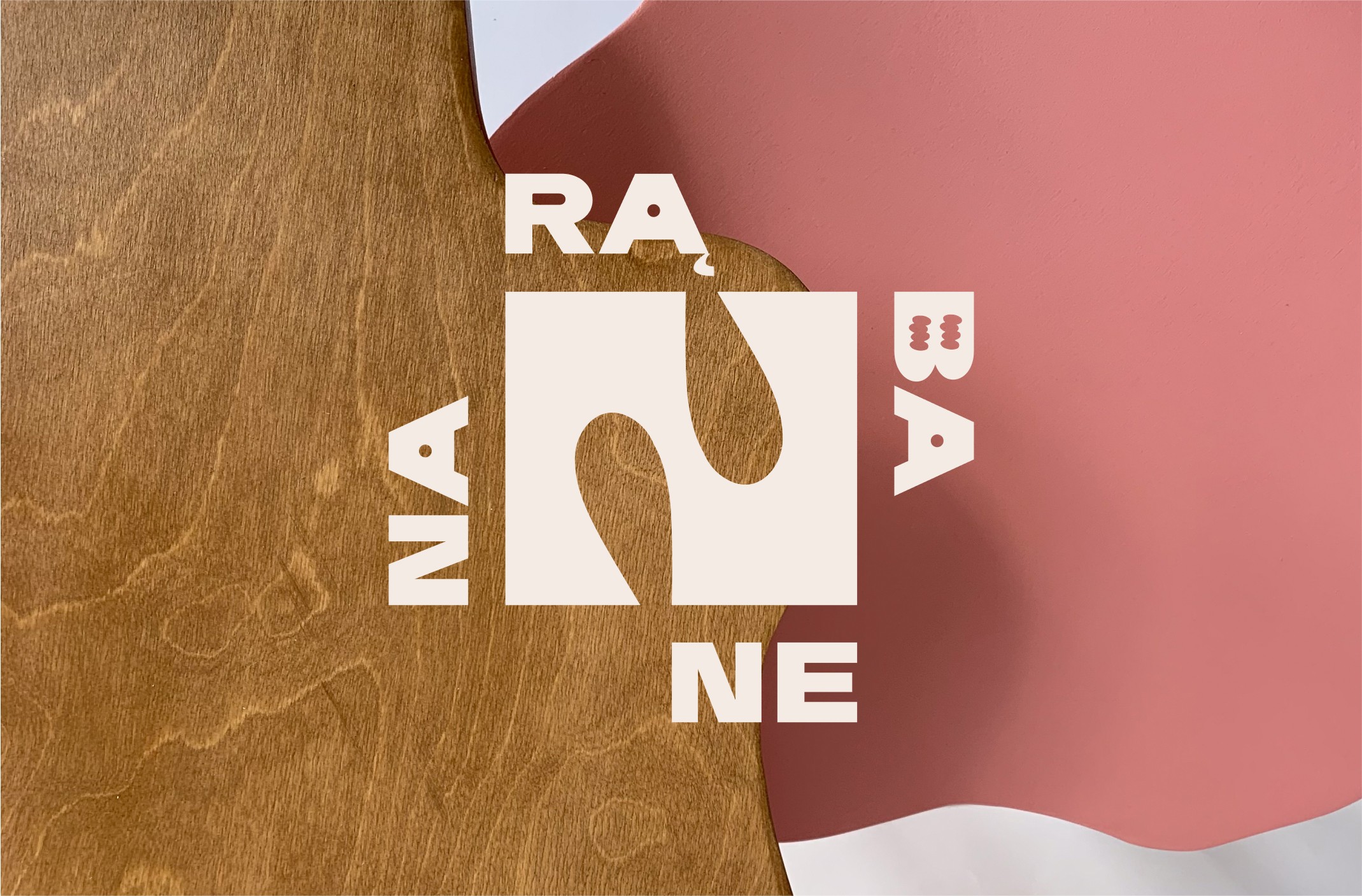
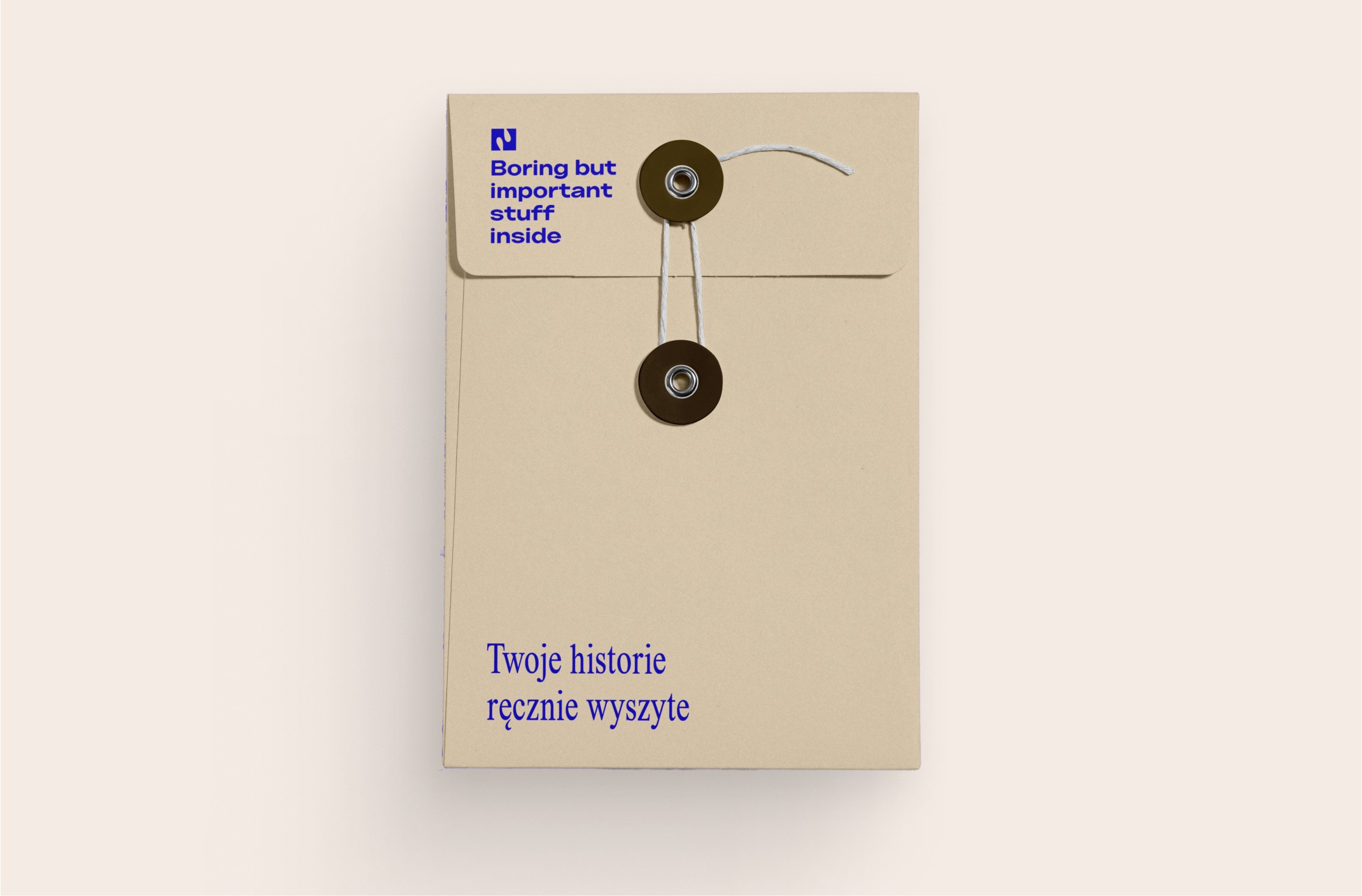
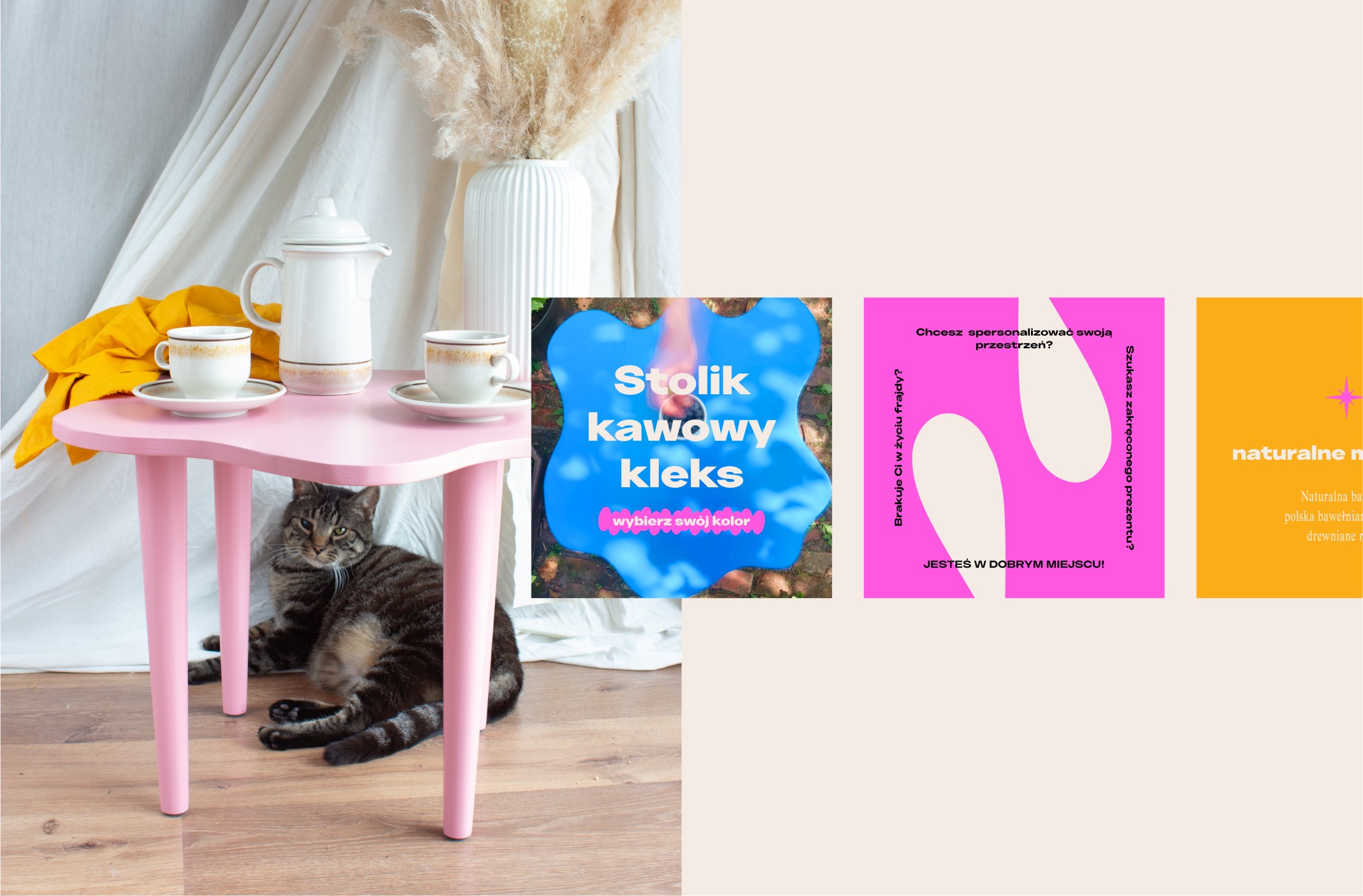
Each identity was built to match the tone of the product and audience. Shared elements like the grid and tone of voice helped the two feel related without being repetitive.
Digital & Web
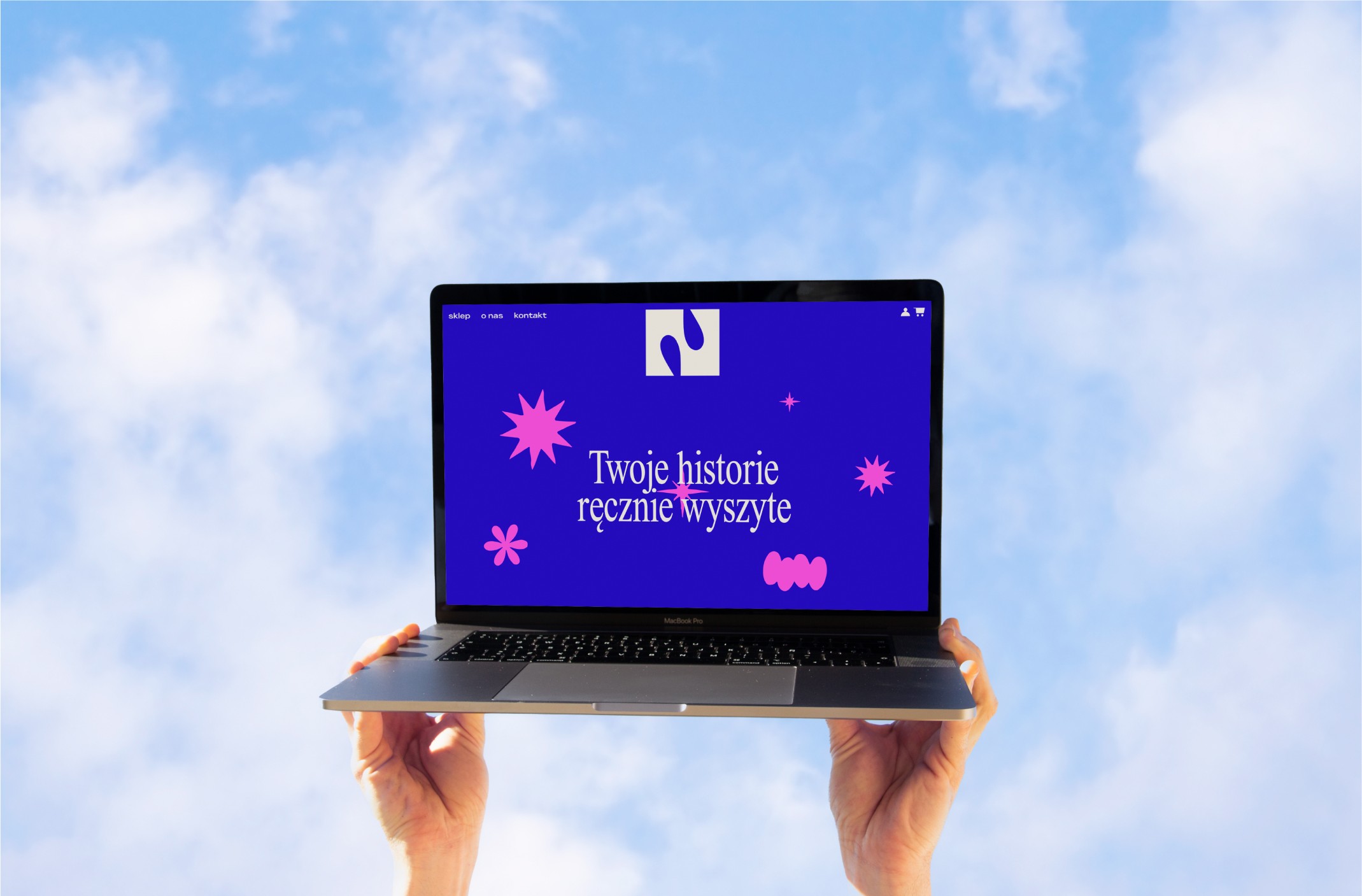
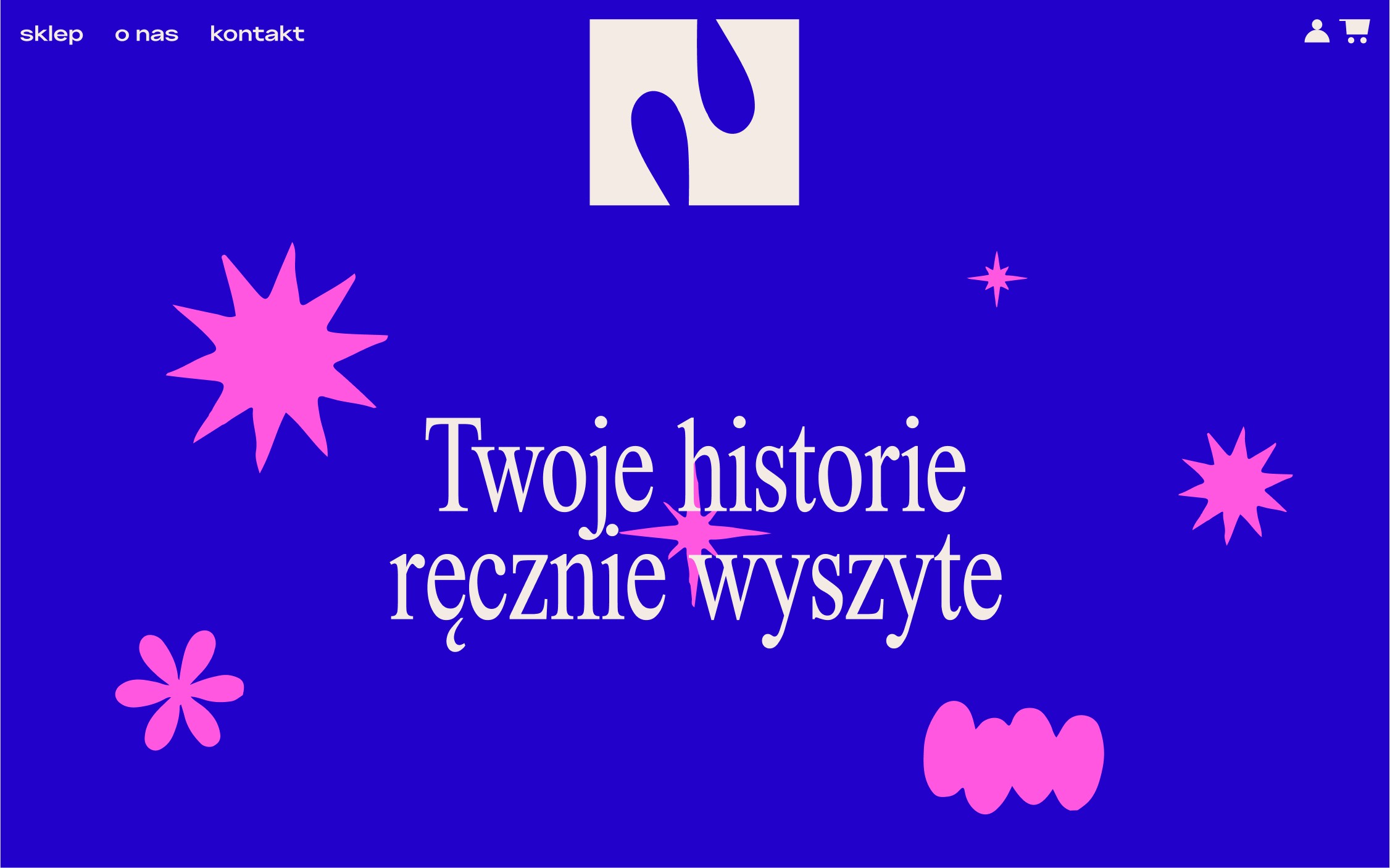
I created a web design concept that brought the visual identity online—using microinteractions, scroll-based movement, and energetic layouts. While this wasn't part of the final scope, it helped show how the brands could live across touchpoints.
THE OUTCOME
Both brands launched with the identity system and have been used actively across all platforms. Łucja found the process not only clarifying for the brand—but also for her role as a founder and maker.
The project created a clear, energetic foundation that can grow with the business and evolve as more products, platforms, or content are introduced.
Home Decor
D2C
Brand Launch
challenge
Create two separate but connected visual identities for embroidery and woodworking brands targeting younger renters looking for expressive, accessible home decor.
solution
Brand Strategy
Visual Identity
Collateral Suite
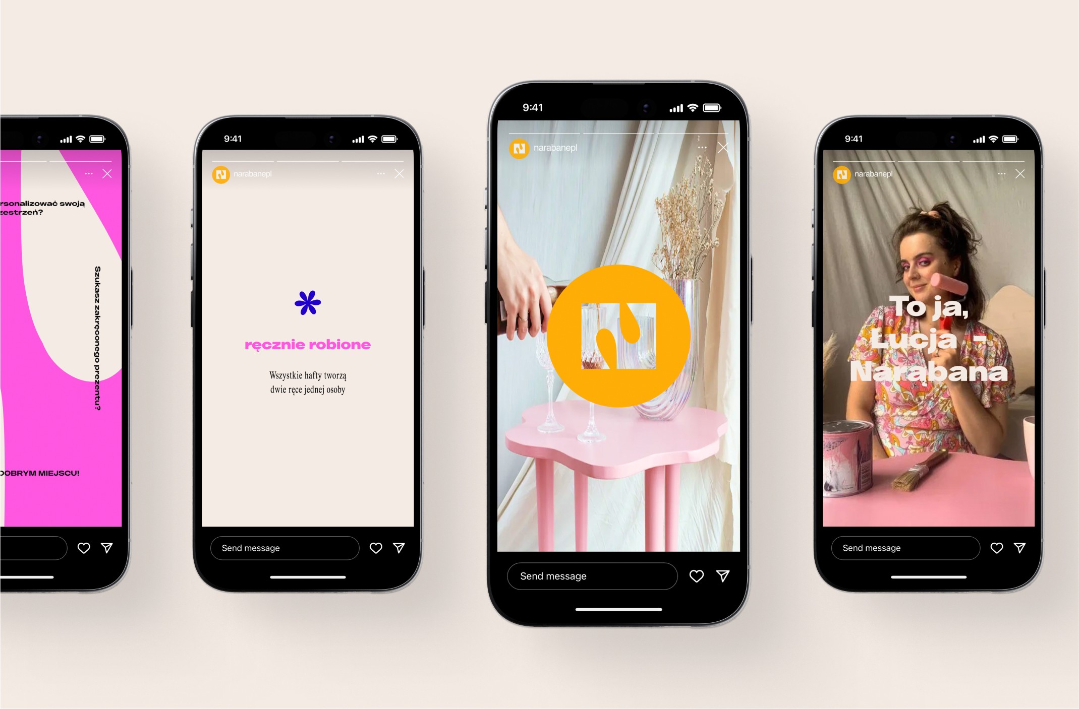
Social Media Design
Conceptual Web Design
Client Retainer
impact
The brands launched with strong, distinctive identities and a clear market position. The founder continues to use the system actively and has built an engaged online community with visuals and messaging that reflect her original goals.
Narąbane & Naprute
read full case study
Branding a bold, dual-crafted home decor brand for millennials & gen Z
A vibrant, purpose-led identity system for two sister brands empowering renters to personalise their homes.
THE CHALLENGE
Łucja launched Narąbane (woodworking) and Naprute (embroidery) to bring more character and colour into the homes of Millennials and Gen Z. Her goal was to offer home decor that felt bold, affordable, and expressive without relying on mass production.
She needed two visual identities that could stand on their own, while still feeling like part of the same ecosystem. The brands had to appeal to a younger audience in rented spaces, communicate quality without looking overly polished, and reflect her values as a founder. Łucja’s own story—leaving behind burnout and corporate culture—was an important part of the brand energy too.
OUR APPROACH
This was a full-scope project that included brand strategy, visual identity, and web design. We started by defining the market positioning and customer mindset. Many of Łucja’s future customers were creative, design-aware, and used to adapting their homes on a budget. They wanted cheeky decor that made a statement, even in small or rented spaces.
Strategy
We focused on shaping a brand world that felt confident and fun. Instead of following minimal trends or overly “crafted” aesthetics, we leaned into colour, personality, and clarity. Both brands needed to be strong on their own while sharing a visual rhythm that tied them together.
Visual Identity
Each identity was built to match the tone of the product and audience. Shared elements like the grid and tone of voice helped the two feel related without being repetitive.
Digital & Web
I created a web design concept that brought the visual identity online—using microinteractions, scroll-based movement, and energetic layouts. While this wasn't part of the final scope, it helped show how the brands could live across touchpoints.
THE OUTCOME
Both brands launched with the identity system and have been used actively across all platforms. Łucja found the process not only clarifying for the brand—but also for her role as a founder and maker.
The project created a clear, energetic foundation that can grow with the business and evolve as more products, platforms, or content are introduced.
Home Decor
D2C
Brand Launch
challenge
Create two separate but connected visual identities for embroidery and woodworking brands targeting younger renters looking for expressive, accessible home decor.
solution
Brand Strategy
Visual Identity
Collateral Suite
Social Media Design
Conceptual Web Design
Client Retainer
impact
The brands launched with strong, distinctive identities and a clear market position. The founder continues to use the system actively and has built an engaged online community with visuals and messaging that reflect her original goals.
Narąbane & Naprute
Branding a bold, dual-crafted home decor brand for millennials & gen Z
read full case study
A vibrant, purpose-led identity system for two sister brands empowering renters to personalise their homes.
THE CHALLENGE
Łucja launched Narąbane (woodworking) and Naprute (embroidery) to bring more character and colour into the homes of Millennials and Gen Z. Her goal was to offer home decor that felt bold, affordable, and expressive without relying on mass production.
She needed two visual identities that could stand on their own, while still feeling like part of the same ecosystem. The brands had to appeal to a younger audience in rented spaces, communicate quality without looking overly polished, and reflect her values as a founder. Łucja’s own story—leaving behind burnout and corporate culture—was an important part of the brand energy too.
OUR APPROACH
This was a full-scope project that included brand strategy, visual identity, and web design. We started by defining the market positioning and customer mindset. Many of Łucja’s future customers were creative, design-aware, and used to adapting their homes on a budget. They wanted cheeky decor that made a statement, even in small or rented spaces.
Strategy
We focused on shaping a brand world that felt confident and fun. Instead of following minimal trends or overly “crafted” aesthetics, we leaned into colour, personality, and clarity. Both brands needed to be strong on their own while sharing a visual rhythm that tied them together.
Visual Identity
Each identity was built to match the tone of the product and audience. Shared elements like the grid and tone of voice helped the two feel related without being repetitive.
Digital & Web
I created a web design concept that brought the visual identity online—using microinteractions, scroll-based movement, and energetic layouts. While this wasn't part of the final scope, it helped show how the brands could live across touchpoints.
THE OUTCOME
Both brands launched with the identity system and have been used actively across all platforms. Łucja found the process not only clarifying for the brand—but also for her role as a founder and maker.
The project created a clear, energetic foundation that can grow with the business and evolve as more products, platforms, or content are introduced.
Home Decor
D2C
Brand Launch
challenge
Create two separate but connected visual identities for embroidery and woodworking brands targeting younger renters looking for expressive, accessible home decor.
solution
Brand Strategy
Visual Identity
Collateral Suite
Social Media Design
Conceptual Web Design
Client Retainer
impact
The brands launched with strong, distinctive identities and a clear market position. The founder continues to use the system actively and has built an engaged online community with visuals and messaging that reflect her original goals.


In the client’s words
“I felt really taken care of throughout the process. What I thought was a chaotic mix of ideas turned into a brand I feel proud of and excited to grow. You helped me understand my own brand better than ever.”
“I felt really taken care of throughout the process. What I thought was a chaotic mix of ideas turned into a brand I feel proud of and excited to grow. You helped me understand my own brand better than ever.”
Łucja
— Founder, Narąbane & Naprute
See more of our work


Let’s discuss your project!