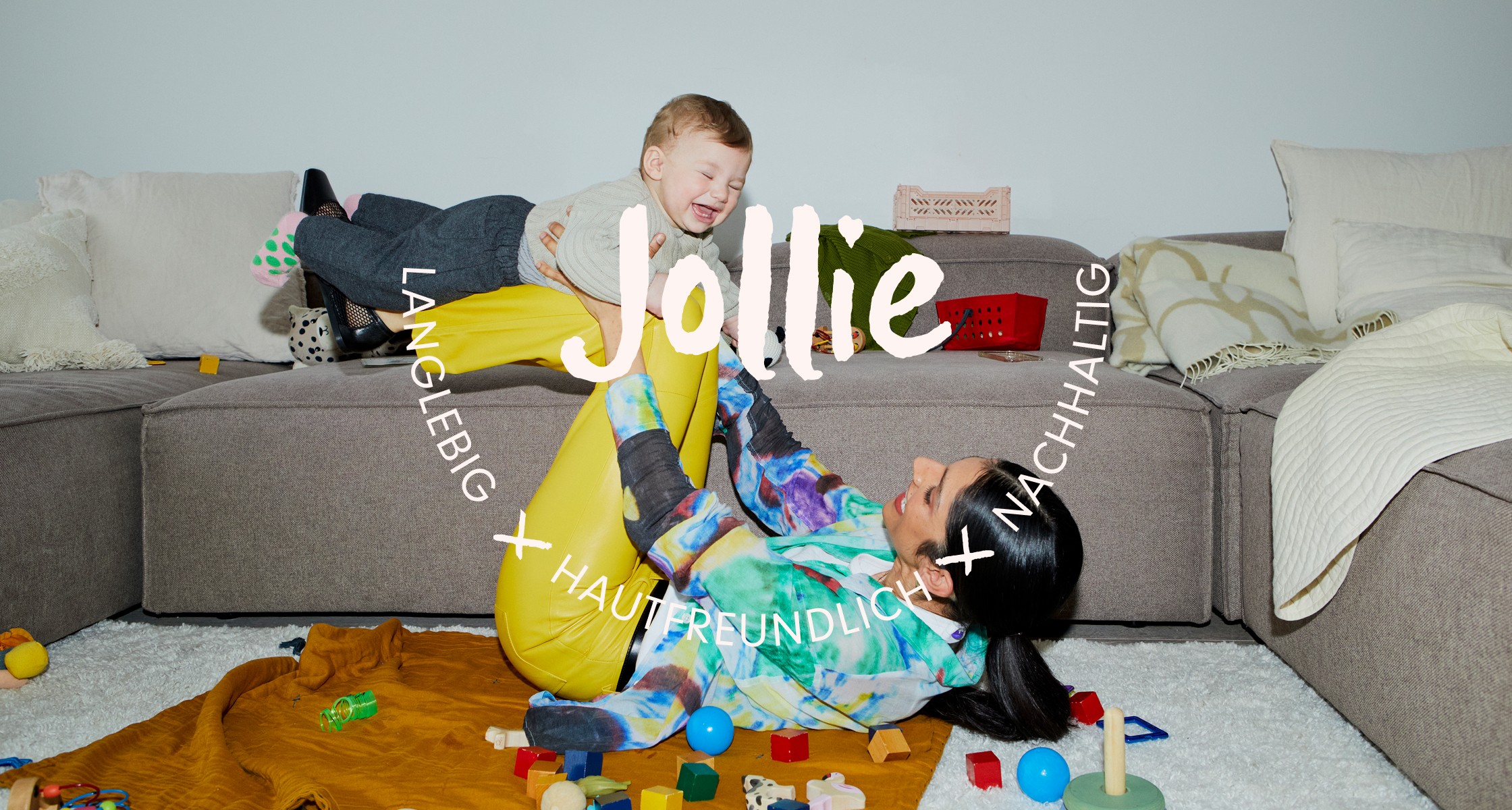
Jollie
read full case study
A brand for better baby bums (and happier parents)
How we created a joyful, planet-conscious diaper brand that made reusables feel easy, modern, and kind.
THE CHALLENGE
When two new moms couldn’t find reusable diapers that met their standards for quality, sustainability, and ease, they decided to build their own solution. Enter Jollie—a brand-new company founded on a beautifully simple mission: make diapering easier for parents, better for the planet, and gentler on babies' skin.
They came to me with a strong product—Babysnaps, adjustable cloth diapers that grow with your baby—but no clear visual identity, brand voice, or strategy. Their goal? Elevate from an early idea to a brand that could confidently challenge the disposables industry and live proudly in modern homes and retail shelves alike.
OUR APPROACH
This was a long-form, full-scope project that spanned several months. From strategy and positioning to illustration and icon design, I had the opportunity to shape every aspect of the brand. With complete creative ownership, we built a visual and verbal identity that felt as nurturing, considered, and clever as the product itself.
Brand Strategy
We began by defining the brand’s personality and place in the market:
– A solution-aware audience: curious, mindful, and seeking better diapering options
– A clear positioning strategy to stand out against legacy brands
– A unique blend of archetypes
– A tone of voice rooted in clarity, optimism, and trust
Our core idea became the anchor:
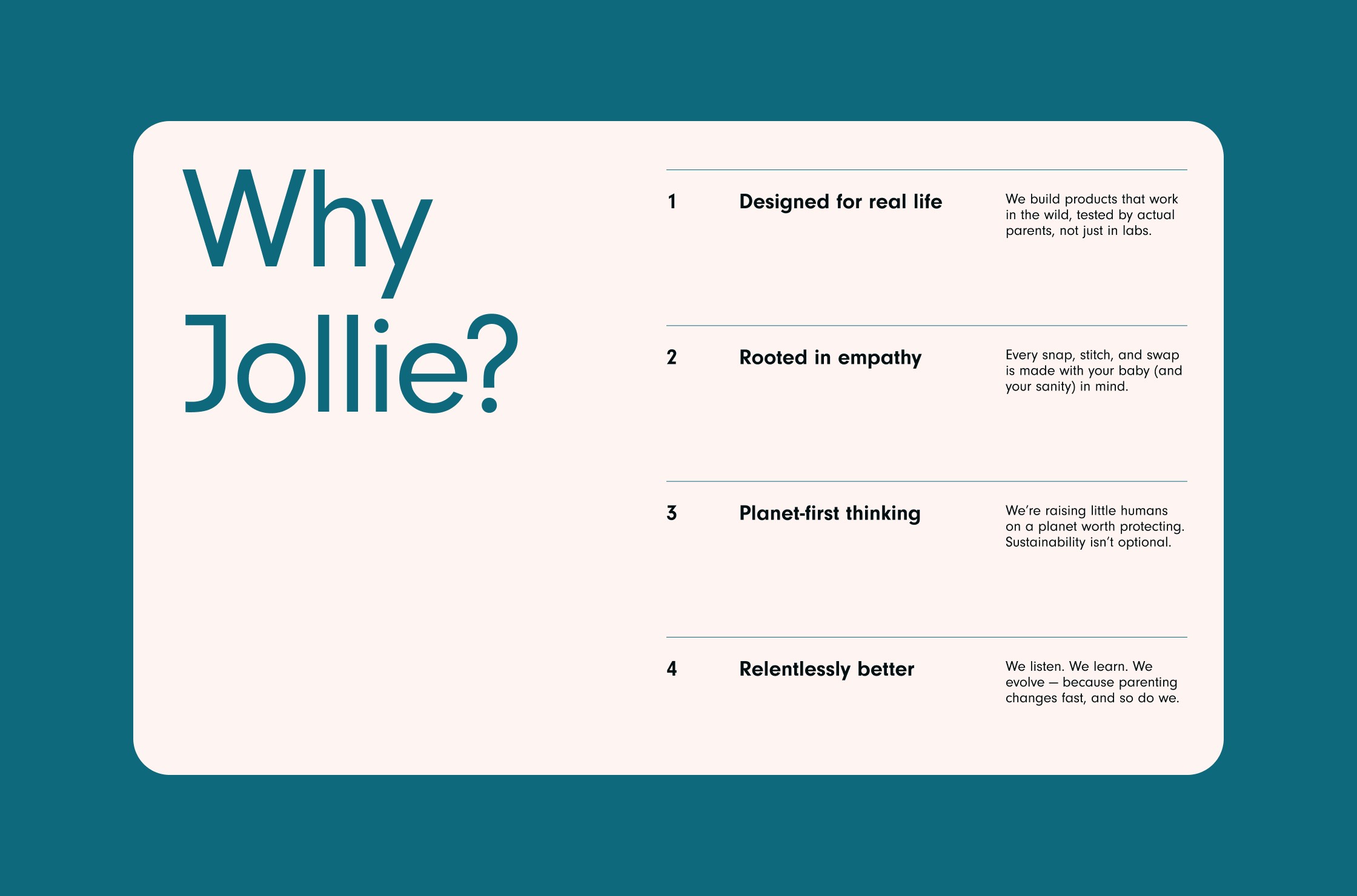
Ease, joy, and high quality—without the mental load.
Babysnaps would be the no-compromise diaper: conscious, convenient, and beautifully designed.
Visual Identity
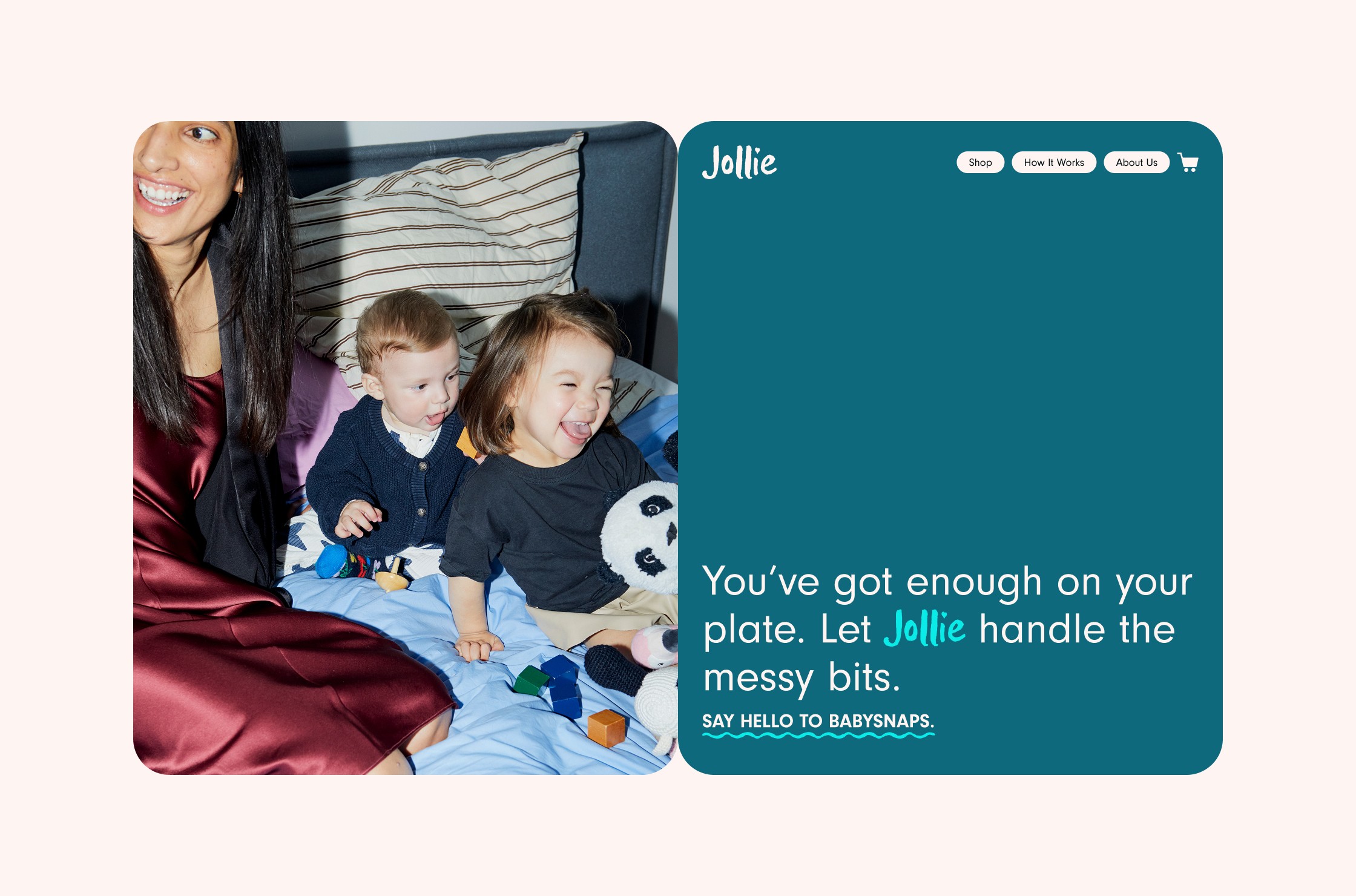
The identity needed to feel joyful without being childish, modern without being sterile. Key design elements included:
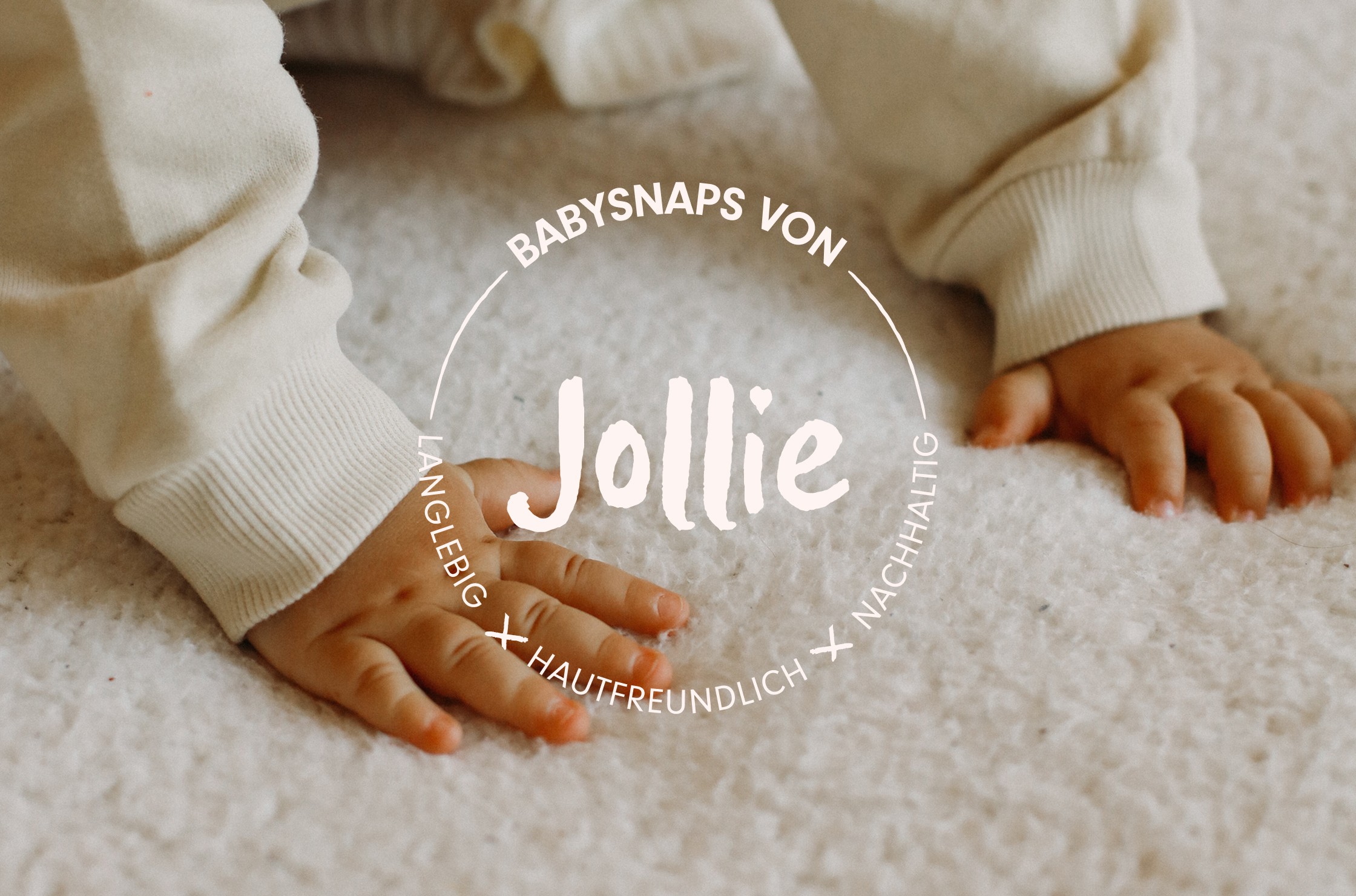
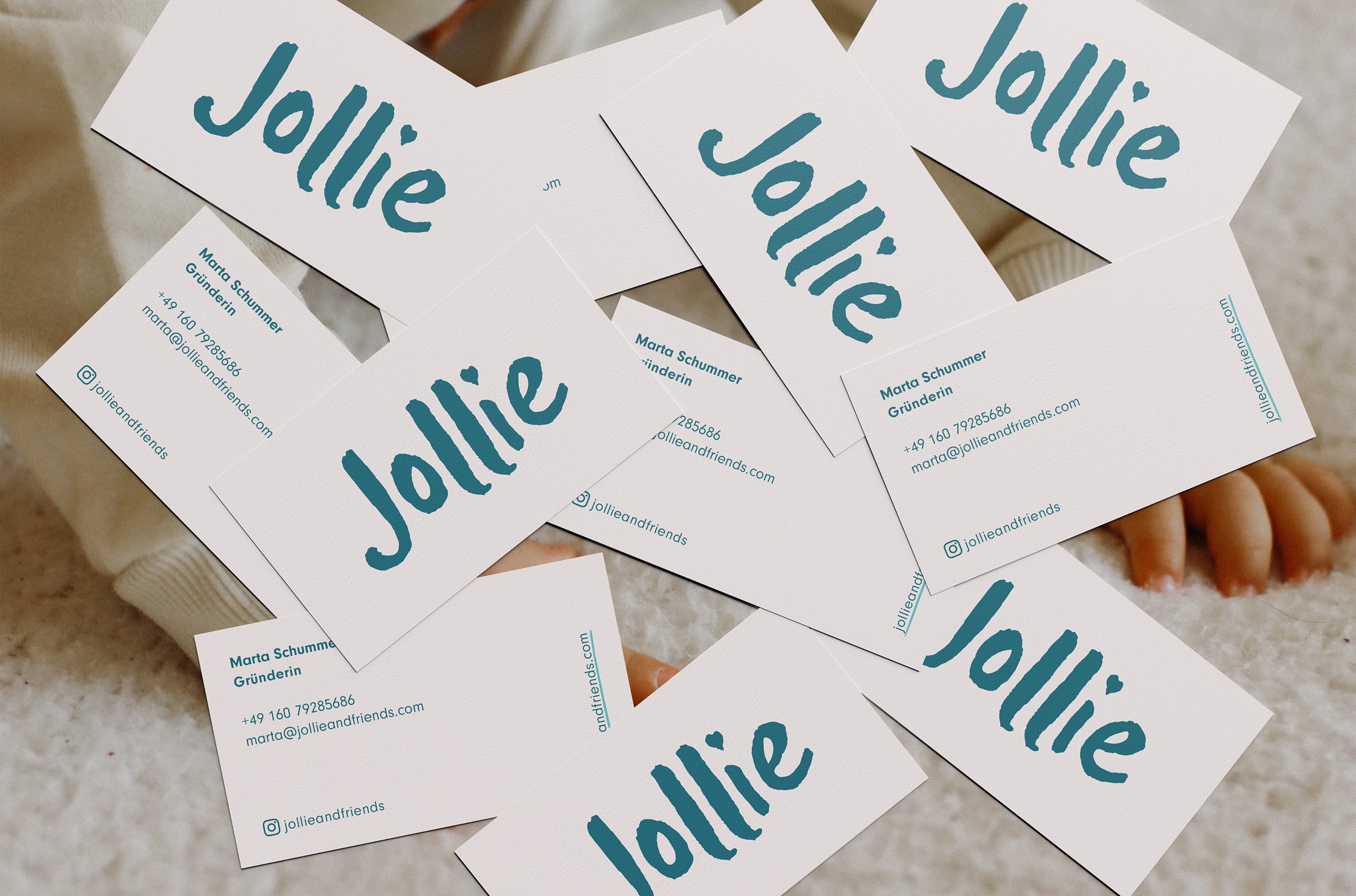
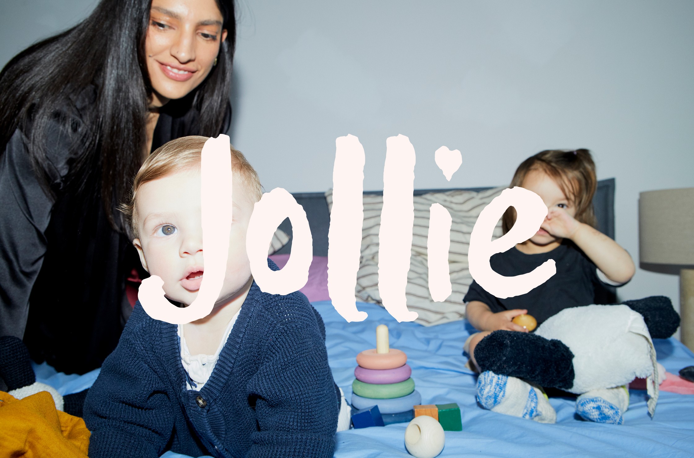
– A custom wordmark with soft, organic curves
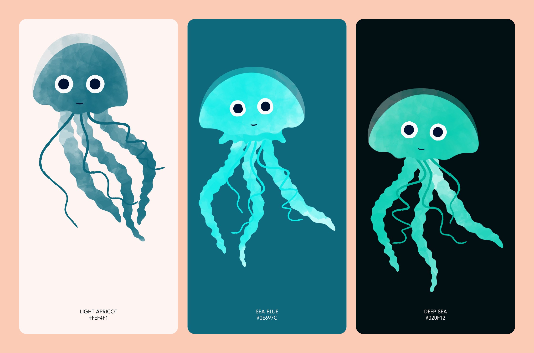
– A calming, optimistic colour palette
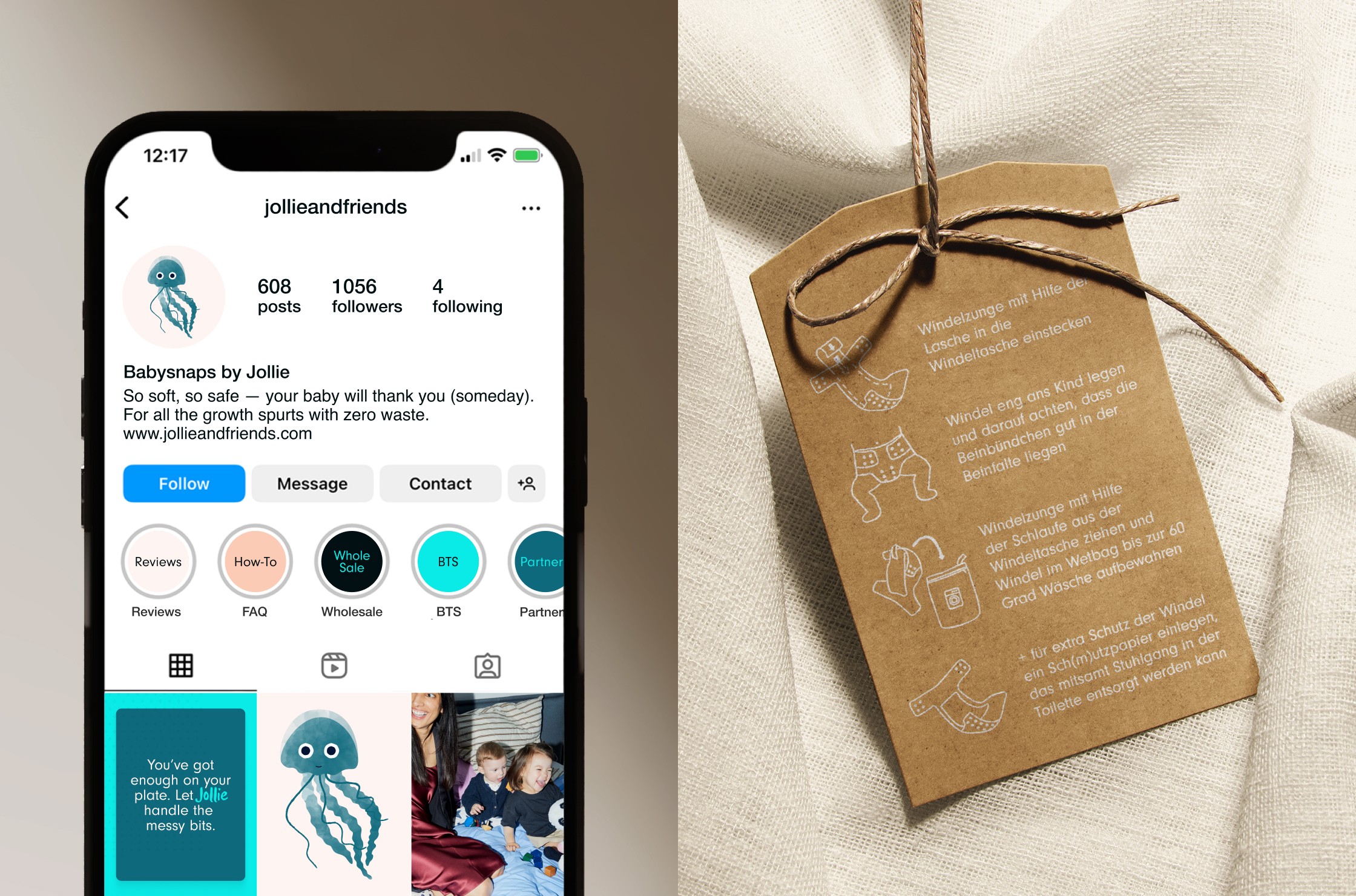
– An original brand mascot—Jollie the jellyfish—designed to evoke softness, joy, and movement
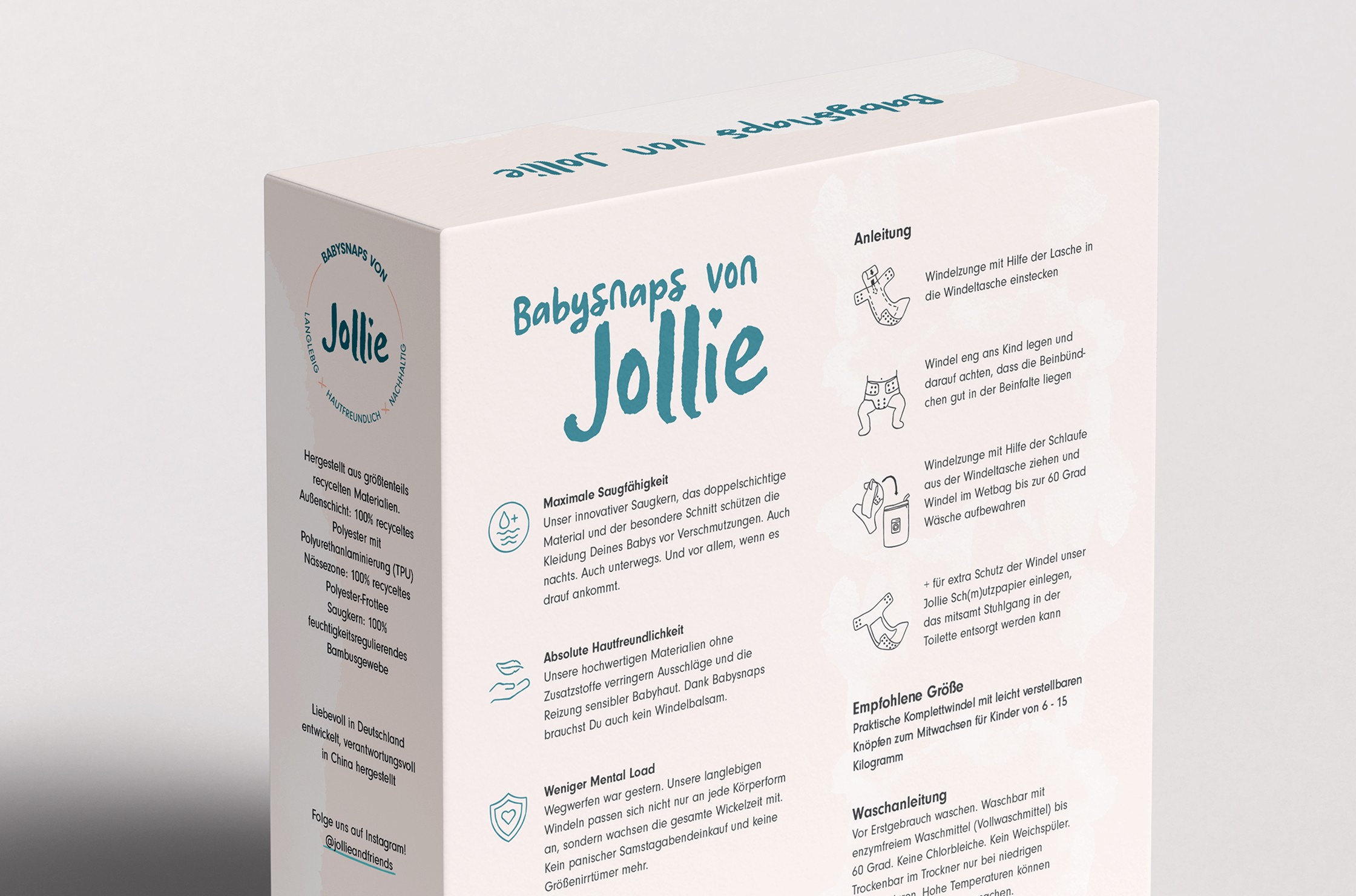
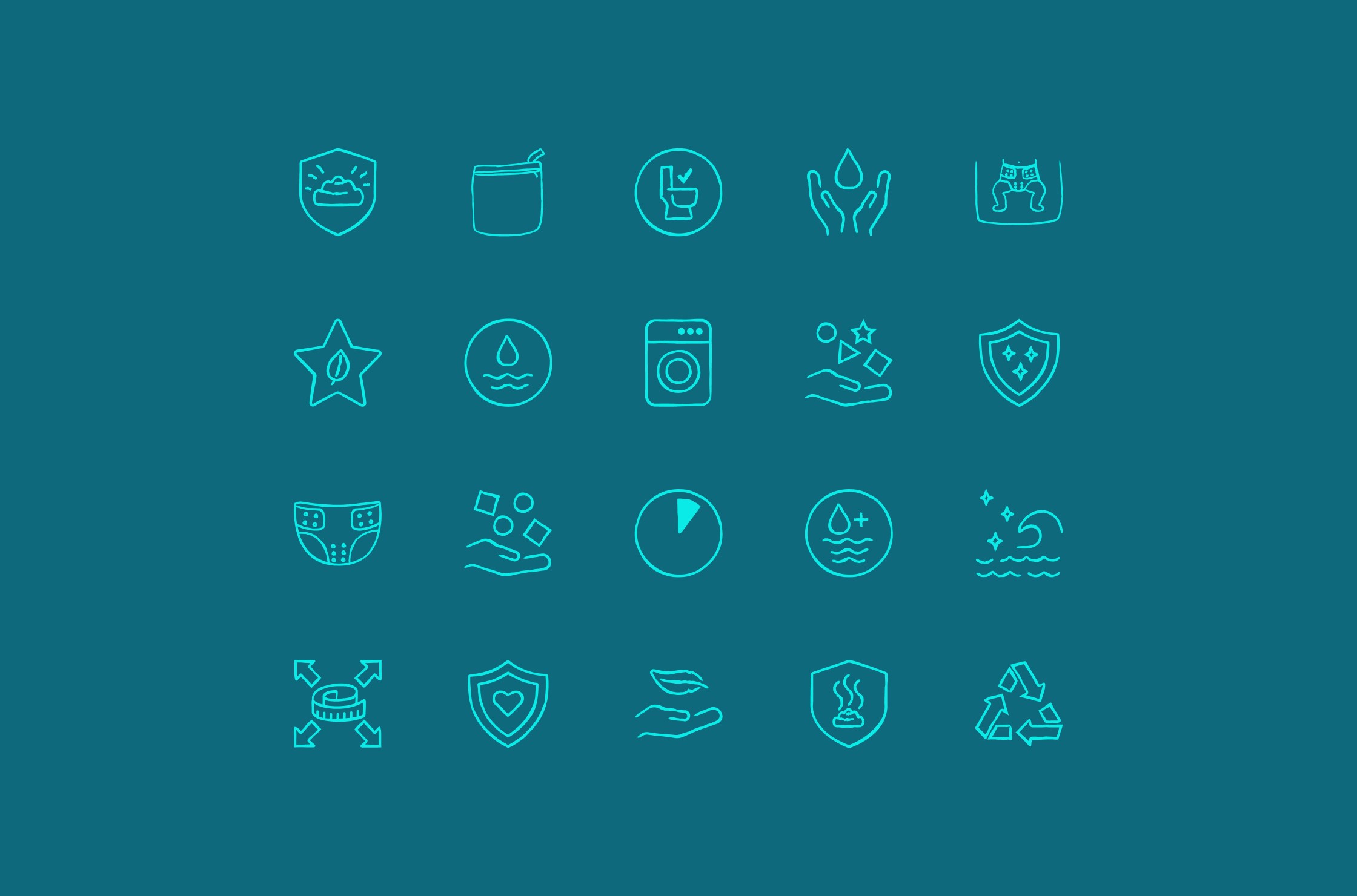
– A suite of hand-drawn icons to explain product features, instructions, and USPs with ease and charm
Packaging & Collateral
We designed every touchpoint with intention—from packaging concepts and instruction inserts to email footers and social templates. The result was a brand that felt fully realised, cohesive, and launch-ready across digital and print.
THE OUTCOME
Though the brand was renamed before launch due to trademark restrictions, the strategy and visual identity we built became the foundation for the next chapter. The client told me the work brought clarity and direction to their vision—helping them feel confident moving forward.
For me, this project was a creative highlight—an opportunity to lead a thoughtful, comprehensive brand build that felt joyful, intentional, and rooted in real purpose.
Parenting & Baby Care
B2C
Pre-Launch
challenge
We needed to turn a great product idea into a credible, joyful brand that parents would love and trust.
solution
Brand Strategy
Visual Identity
Mascot Illustration
Icons
Packaging
Collateral Suite
impact
A fully realised brand foundation that helped the founders move confidently into launch mode.
Jollie
read full case study
A brand for better baby bums (and happier parents)
How we created a joyful, planet-conscious diaper brand that made reusables feel easy, modern, and kind.
THE CHALLENGE
When two new moms couldn’t find reusable diapers that met their standards for quality, sustainability, and ease, they decided to build their own solution. Enter Jollie—a brand-new company founded on a beautifully simple mission: make diapering easier for parents, better for the planet, and gentler on babies' skin.
They came to me with a strong product—Babysnaps, adjustable cloth diapers that grow with your baby—but no clear visual identity, brand voice, or strategy. Their goal? Elevate from an early idea to a brand that could confidently challenge the disposables industry and live proudly in modern homes and retail shelves alike.
OUR APPROACH
This was a long-form, full-scope project that spanned several months. From strategy and positioning to illustration and icon design, I had the opportunity to shape every aspect of the brand. With complete creative ownership, we built a visual and verbal identity that felt as nurturing, considered, and clever as the product itself.
Brand Strategy
We began by defining the brand’s personality and place in the market:
– A solution-aware audience: curious, mindful, and seeking better diapering options
– A clear positioning strategy to stand out against legacy brands
– A unique blend of archetypes
– A tone of voice rooted in clarity, optimism, and trust
Our core idea became the anchor:
Ease, joy, and high quality—without the mental load.
Babysnaps would be the no-compromise diaper: conscious, convenient, and beautifully designed.
Visual Identity
The identity needed to feel joyful without being childish, modern without being sterile. Key design elements included:
– A custom wordmark with soft, organic curves
– A calming, optimistic colour palette
– An original brand mascot—Jollie the jellyfish—designed to evoke softness, joy, and movement
– A suite of hand-drawn icons to explain product features, instructions, and USPs with ease and charm
Packaging & Collateral
We designed every touchpoint with intention—from packaging concepts and instruction inserts to email footers and social templates. The result was a brand that felt fully realised, cohesive, and launch-ready across digital and print.
THE OUTCOME
Though the brand was renamed before launch due to trademark restrictions, the strategy and visual identity we built became the foundation for the next chapter. The client told me the work brought clarity and direction to their vision—helping them feel confident moving forward.
For me, this project was a creative highlight—an opportunity to lead a thoughtful, comprehensive brand build that felt joyful, intentional, and rooted in real purpose.
Parenting & Baby Care
B2C
Pre-Launch
challenge
We needed to turn a great product idea into a credible, joyful brand that parents would love and trust.
solution
Brand Strategy
Visual Identity
Mascot Illustration
Icons
Packaging
Collateral Suite
impact
A fully realised brand foundation that helped the founders move confidently into launch mode.
Jollie
A brand for better baby bums (and happier parents)
read full case study
How we created a joyful, planet-conscious diaper brand that made reusables feel easy, modern, and kind.
THE CHALLENGE
When two new moms couldn’t find reusable diapers that met their standards for quality, sustainability, and ease, they decided to build their own solution. Enter Jollie—a brand-new company founded on a beautifully simple mission: make diapering easier for parents, better for the planet, and gentler on babies' skin.
They came to me with a strong product—Babysnaps, adjustable cloth diapers that grow with your baby—but no clear visual identity, brand voice, or strategy. Their goal? Elevate from an early idea to a brand that could confidently challenge the disposables industry and live proudly in modern homes and retail shelves alike.
OUR APPROACH
This was a long-form, full-scope project that spanned several months. From strategy and positioning to illustration and icon design, I had the opportunity to shape every aspect of the brand. With complete creative ownership, we built a visual and verbal identity that felt as nurturing, considered, and clever as the product itself.
Brand Strategy
We began by defining the brand’s personality and place in the market:
– A solution-aware audience: curious, mindful, and seeking better diapering options
– A clear positioning strategy to stand out against legacy brands
– A unique blend of archetypes
– A tone of voice rooted in clarity, optimism, and trust
Our core idea became the anchor:
Ease, joy, and high quality—without the mental load.
Babysnaps would be the no-compromise diaper: conscious, convenient, and beautifully designed.
Visual Identity
The identity needed to feel joyful without being childish, modern without being sterile. Key design elements included:
– A custom wordmark with soft, organic curves
– A calming, optimistic colour palette
– An original brand mascot—Jollie the jellyfish—designed to evoke softness, joy, and movement
– A suite of hand-drawn icons to explain product features, instructions, and USPs with ease and charm
Packaging & Collateral
We designed every touchpoint with intention—from packaging concepts and instruction inserts to email footers and social templates. The result was a brand that felt fully realised, cohesive, and launch-ready across digital and print.
THE OUTCOME
Though the brand was renamed before launch due to trademark restrictions, the strategy and visual identity we built became the foundation for the next chapter. The client told me the work brought clarity and direction to their vision—helping them feel confident moving forward.
For me, this project was a creative highlight—an opportunity to lead a thoughtful, comprehensive brand build that felt joyful, intentional, and rooted in real purpose.
Parenting & Baby Care
B2C
Pre-Launch
challenge
We needed to turn a great product idea into a credible, joyful brand that parents would love and trust.
solution
Brand Strategy
Visual Identity
Mascot Illustration
Icons
Packaging
Collateral Suite
impact
A fully realised brand foundation that helped the founders move confidently into launch mode.
In the client’s words
“Willda design studio did a great job at understanding our needs and wants and was able to transform this into outstanding work. Weronika created a whole Corporate Identity that is so lovely and fitting. The process helped us reflect on the brand we want to build.”
“Willda design studio did a great job at understanding our needs and wants and was able to transform this into outstanding work. Weronika created a whole Corporate Identity that is so lovely and fitting. The process helped us reflect on the brand we want to build.”
— Co-Founders, Jollie
See more of our work


Let’s discuss your project!